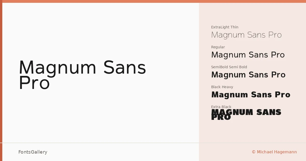
About Magnum Sans Pro Font
There is a disciplined tension running through Michael Hagemann's geometric sans — the kind that comes from a designer who has thought carefully about how much character a neutral letterform can hold before it tips into personality. Built around clean, open architecture, the family rewards both large-scale display work and the quieter demands of structured layout. The copyright dates to 2014 and the family is available in OTF format.
Design Aesthetics & Character Characteristics
Eleven styles run the full weight range from Thin through Extra Black, giving you a genuinely usable gradient from the almost-invisible to the boldly commanding. That span is where the design pays off: the lighter cuts feel minimal and considered, while the heavier weights — Heavy, Black, Extra Black — have real presence without ever becoming crude. The overall mood sits at the intersection of modern and professional, making the family feel at home in contexts where restraint and authority need to coexist on the same page.
Recommended Usage & Font Pairing
The weight range suits headline and poster work naturally, and the cleaner mid-weights carry branding and logo applications well. Magazine layouts in particular benefit from the controlled contrast between the lighter and bolder cuts. For pairing, the family has been matched with Canela, Armelie, 321 Impact, ABC Arizona, and Kactigona — a mix of serif and expressive faces that play productively against the family's structural restraint.
License & Usage Terms
This is a Demo license with personal-use terms only — confirm licensing for any commercial job by visiting www.fontmesa.com before setting it in client work. Embedding is permitted with editable rights.