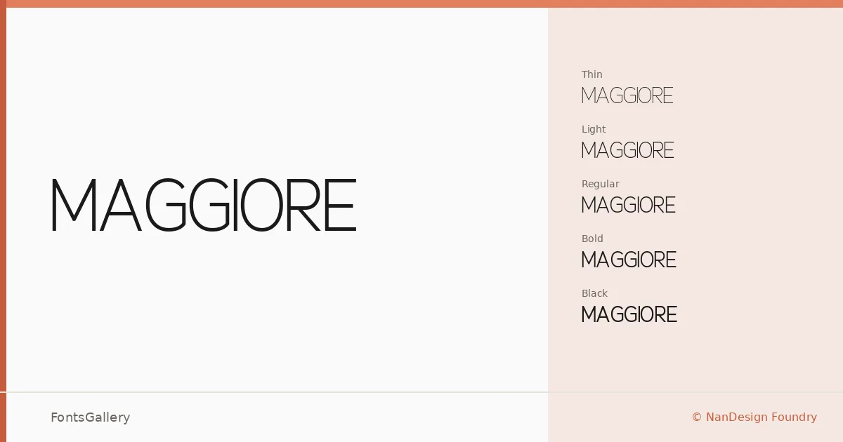
About Maggiore Font
There is a quiet confidence in the way this sans serif holds itself — clean strokes, restrained geometry, and spacing that never feels hurried. Designed by Frada Nanda for NanDesign Foundry, it carries an elegant, minimal character that reads as both modern and composed across every weight.
Design Aesthetics & Character Characteristics
The family spans five weights — Thin, Light, Regular, Bold, and Black — giving it a range that moves from nearly whisper-thin strokes to a commanding heaviness without the letterforms ever losing their professional composure. Available in OTF, the cuts share a consistent geometric backbone, and the contrast between the extreme ends of the range is genuinely dramatic. That breadth is what makes the family useful rather than merely good-looking.
Recommended Usage & Font Pairing
The lighter weights feel at home in editorial settings — magazine layouts, website headers, branding systems where the type needs to recede elegantly behind imagery. The Bold and Black cuts are built for logos and headlines that need presence without shouting. It pairs well with Canela for a warm editorial contrast, with Magnolia Script or Angeletta when a more expressive secondary hand is needed, and with Times New Roman or Minecraft when the brief calls for something more unexpected.
License & Usage Terms
This family is released under a Demo license, which covers personal use only with a donation requested — confirm terms directly with NanDesign Foundry before committing it to any commercial job.