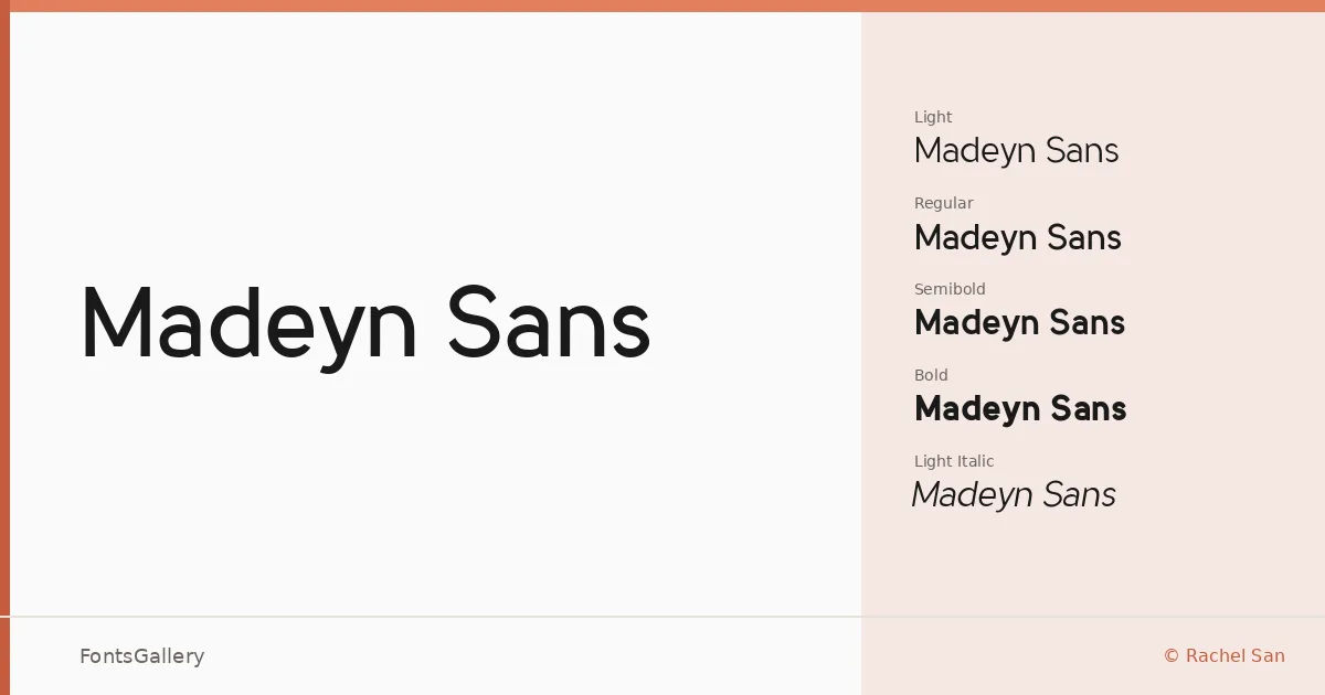
About Madeyn Sans Font
There is a quietness to this sans-serif that earns attention rather than demands it. Designed by Rachel San, the family achieves that particular balance where the letterforms feel scrubbed clean of excess without feeling cold — geometry kept honest, terminals handled with restraint. It arrives in TTF format across eight styles, from Light through Bold with corresponding italics at each weight.
Design Aesthetics & Character Characteristics
The four weights — Light, Regular, Semibold, and Bold — step up gradually, so the family holds together whether you are setting a whisper of a caption or a confident headline. The italics at every level are a genuine asset: they carry the same minimal, professional composure as their upright counterparts rather than leaning into decorative territory. The overall mood is elegant and modern, with the kind of structural clarity that reads well at both display and text sizes.
Recommended Usage & Font Pairing
The family sits naturally inside branding systems, presentation decks, magazine layouts, business cards, and website headers — contexts where a clean, professional voice matters. For contrast, the listed pairings suggest pairing it with a high-contrast serif like Canela, the flowing script of Armelie, the display energy of Urban Thunder Demo, the rounded softness of AQUA, or the structured geometry of Kactigona — each combination pushing the sans in a different tonal direction.
License & Usage Terms
Madeyn Sans is offered under Personal Use terms, which means commercial use is not covered — confirm licensing with the designer before placing it in a client or revenue-generating project. Embedding is permitted at the editable level.