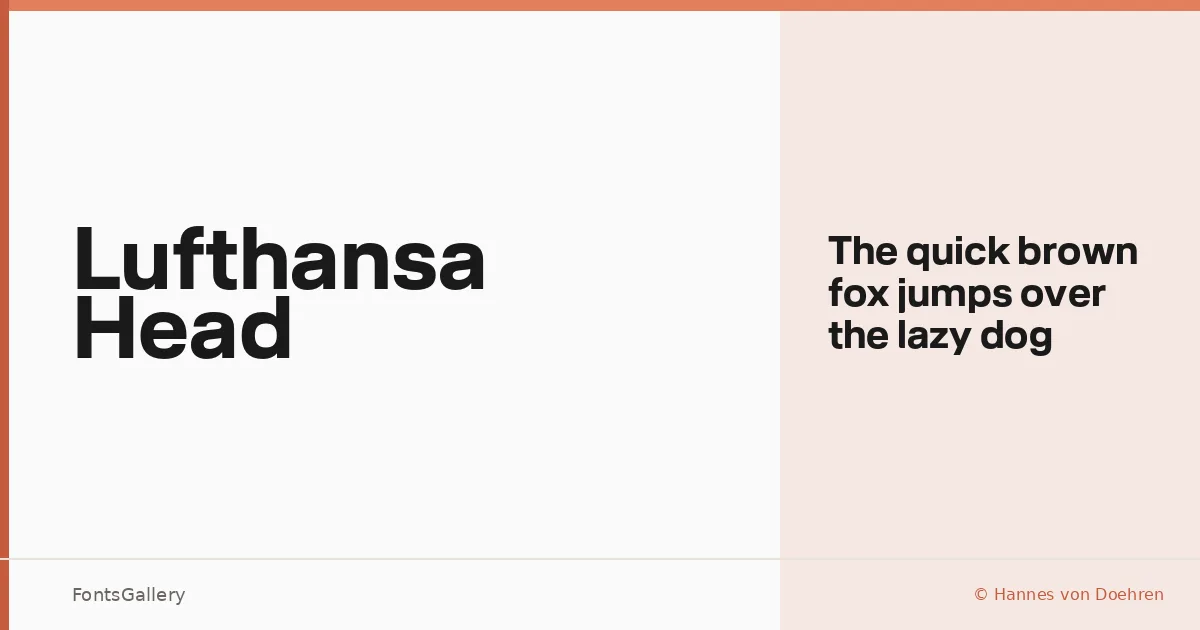
About Lufthansa Head Font
There is a controlled authority to this single-weight sans — the kind of weight that doesn't need to shout because the structure does the work. It was drawn by Hannes von Doehren of HvD Fonts, and it carries his characteristic discipline: optically balanced strokes, clean terminals, and a geometry that reads with confidence at large sizes. The typeface is a registered trademark of Deutsche Lufthansa AG, built specifically for that identity system.
Design Aesthetics & Character Characteristics
The family ships as a single cut — Bold — in OTF format, which tells you exactly what it was designed to do: anchor headlines, not fill body copy. The mood is minimal and professional without being cold, sitting in that territory where modern corporate work lives. Language coverage spans Latin, Cyrillic, and Greek, making it capable across the multilingual demands of a global brand environment. Every letterform is tuned for the demands of advertising, signage, and logo applications where legibility at scale is non-negotiable.
Recommended Usage & Font Pairing
This is a face for headlines, brand marks, and large-format signage — anywhere the type needs to carry institutional weight without decorative distraction. It pairs with AQUA, Ballmain, 321 Impact, Aranea, and Batoshi for designers building out a system that needs complementary voices at smaller sizes or in supporting roles.
License & Usage Terms
This font is released under Personal Use terms, and the license notes explicitly restrict use to Deutsche Lufthansa AG — confirm rights with the rights holder before applying it to any commercial project outside that context. Embedding is permitted at editable level.