About Lipo Font
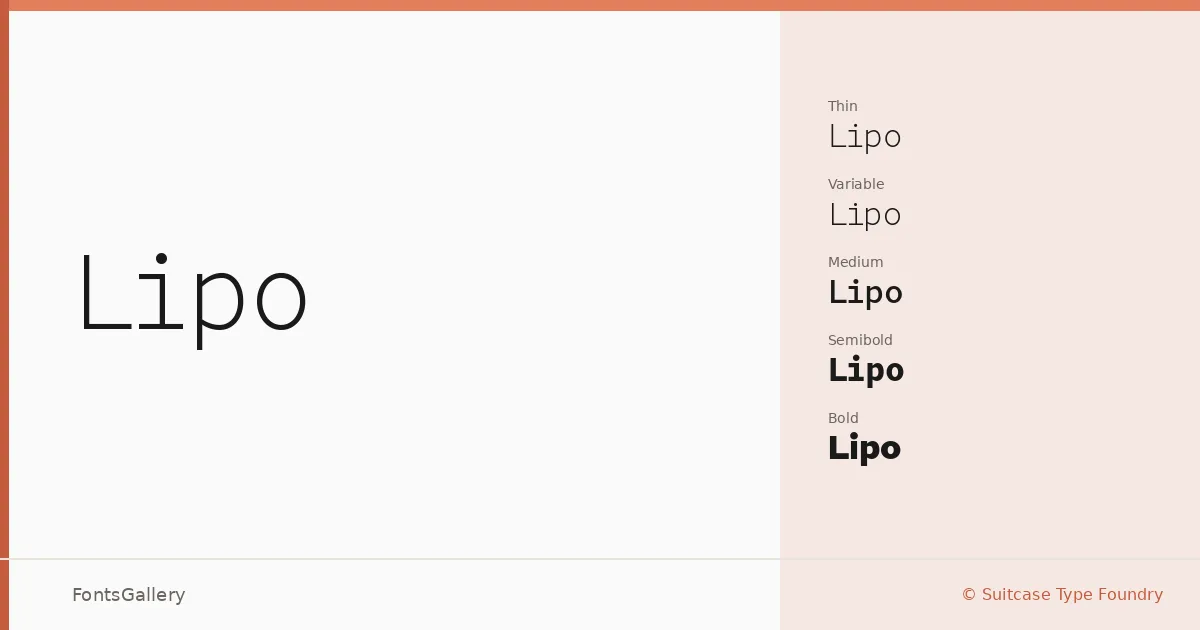
There is a quietness to this sans serif that takes a moment to place — the spacing feels considered, the proportions unhurried, the stroke weight controlled without being clinical. Tomas Brousil at Suitcase Type Foundry has built something that sits confidently between warmth and precision, the kind of restraint that only comes from a designer who knows exactly when to stop.
Design Aesthetics & Character Characteristics
The family spans a wide range of cuts: Thin through Bold in the Text series, each with a matching Italic, plus a separate Compressed branch running from Light through Bold — and a Variable edition that lets you move across the weight range continuously. The Compressed styles bring a different tension to the system, narrower and more taut, useful when the Text weights feel too open. Across all of them the mood holds: elegant, minimal, modern, and professional without ever tipping into sterility. Files ship as OTF and TTF.
Recommended Usage & Font Pairing
The Text weights are well-suited to magazine layouts, website headers, and branding work where you need a sans that reads cleanly at display sizes without losing its composure on a business card. The Compressed cuts add punch to headline settings where vertical space is tight. For pairing, the family has been tested alongside Aranea, Ballmain, 321 Impact, Aresink, and Batoshi, each offering a contrasting texture that plays off the family's even-tempered geometry.
License & Usage Terms
These files are released under a Demo license, which means personal-use terms apply — confirm the full commercial license with Suitcase Type Foundry before using them in any client or commercial job. Embedding is permitted at the editable level.