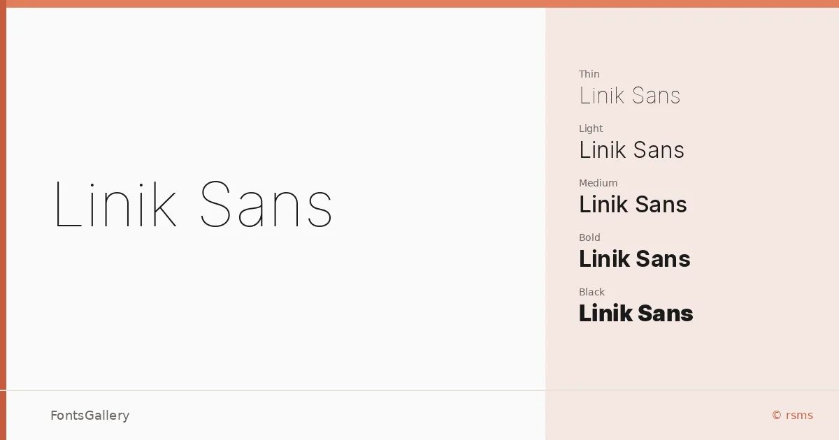
About Linik Sans Font
There is a particular kind of quietness to a well-made geometric sans, and this family has it — clean strokes, open apertures, and just enough humanity to keep it from feeling mechanical. Designed by Rasmus Andersson under the rsms foundry, the family spans an exceptionally wide weight range: Thin through Black, each with a companion italic, giving you eighteen styles in total. The letterforms sit in that confident middle ground between strict rationalism and warmth, which is harder to achieve than it looks.
Design Aesthetics & Character Characteristics
The overall mood is minimal and professional without being cold — qualities that make it as at home in a sleek presentation deck as on a website header. That full Thin-to-Black spectrum means there is genuine contrast available within the family alone, from the barely-there elegance of Thin Italic to the commanding density of Black. The italics are true companions rather than afterthoughts, holding the same structural integrity as the uprights. Files are distributed in TTF format.
Recommended Usage & Font Pairing
The modern, editorial sensibility here suits branding work, magazine layouts, business cards, and anything requiring a header that reads with authority but not aggression. Language coverage extends across Latin, Latin Extended, Cyrillic, Greek, and Vietnamese, so it handles multilingual editorial and business projects without compromise. For contrast pairings, the family works well alongside Canela or Rasley Heights for a serif foil, and Angeletta or Dharma Gothic E when you want something expressive at display scale; Times New Roman is a reliable fallback pairing for longer body copy.
License & Usage Terms
Released under the OFL 1.1 (SIL Open Font License, Version 1.1), this family is available for commercial use, and the embedding permission is set to installable, so you can embed it freely in documents and applications.