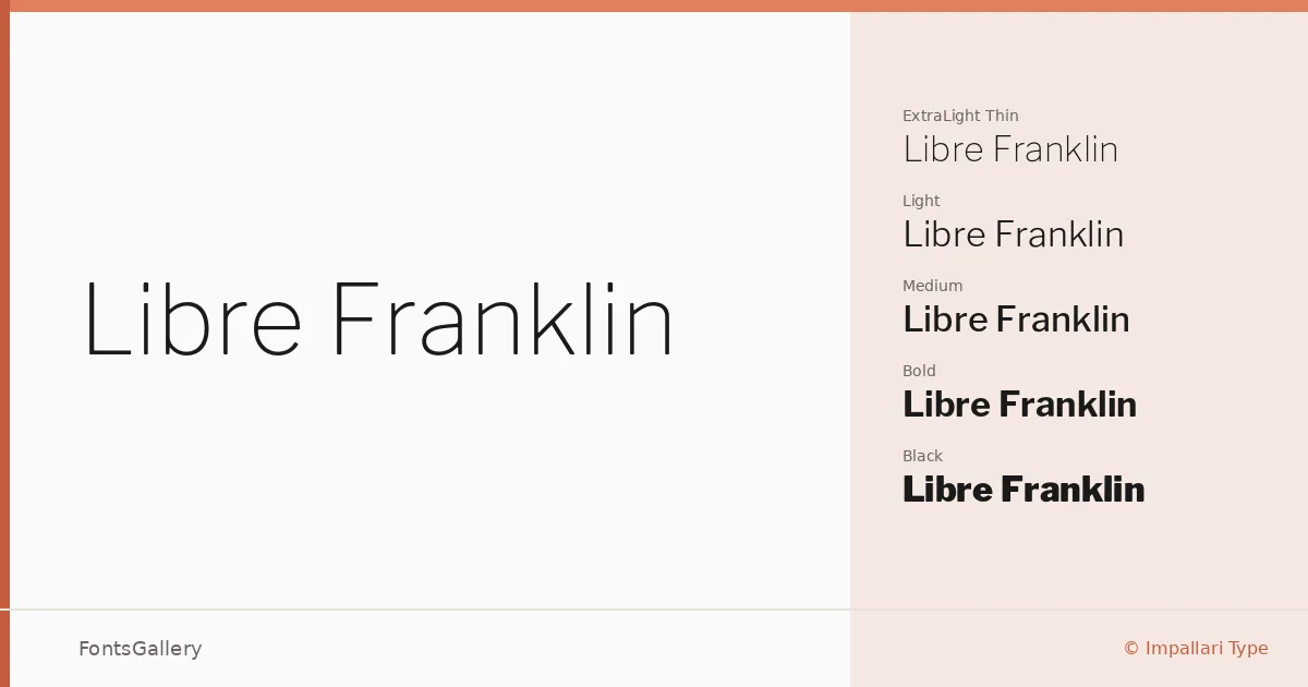
About Libre Franklin Font
There is something immediately trustworthy about a gothique grotesque drawn with this much care — the even stroke contrast, the open apertures, the terminals that know exactly when to stop. Pablo Impallari and Rodrigo Fuenzalida of Impallari Type built this family as a reinterpretation and substantial expansion of Morris Fuller Benton's 1912 classic, carrying its structural logic into a form suited to contemporary work. The result is a grotesque with genuine historical grounding and none of the staleness that can come with it.
Design Aesthetics & Character Characteristics
The family spans a full nine-weight range — Thin through Black — each accompanied by a true italic, giving you eighteen styles in total across TTF and OTF formats. The mood sits squarely in classic, minimal, and professional territory: forms are clean and upright, with the kind of measured neutrality that reads as modern without chasing trends. At the lighter weights the face feels editorial and open; the heavier cuts carry real authority without resorting to bluntness. Latin and partial Latin Extended coverage keeps the character set practical for most Western European work.
Recommended Usage & Font Pairing
The breadth of the weight range makes it genuinely useful across branding systems, magazine layouts, presentation decks, and website headers — any context where hierarchy needs to be built from a single coherent sans. It pairs well with the calligraphic warmth of Armelie, the contemporary serif presence of Canela, the expressive display energy of Urban Thunder Demo, and the contrasting characters of AQUA and Kactigona, giving you options from refined editorial combinations to bolder, more characterful pairings.
License & Usage Terms
Released under the SIL Open Font License (OFL), Version 1.1, with installable embedding permissions — commercial use is fully permitted. Full license terms and FAQ are available at http://scripts.sil.org/OFL.