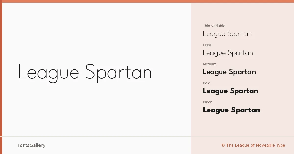
About League Spartan Font
There is a particular confidence in the way this geometric sans carries its weight — the strokes are even, the apertures wide, and the proportions feel rooted in something structural rather than decorative. Released by The League of Moveable Type, it draws on the legacy of mid-century geometric grotesques while keeping the details clean enough for contemporary work. The uppercase forms are especially strong, with a solidity that holds up at any scale.
Design Aesthetics & Character Characteristics
The family runs from Thin through Black — nine static cuts plus a variable font spanning the full weight range — all delivered as TTF files. The mood is modern and minimal without being cold: strokes are optically balanced, spacing feels considered, and the heavier weights carry a bold, professional authority without resorting to novelty. Across the range, the underlying geometry stays consistent, which makes mixing weights within a layout feel natural rather than forced.
Recommended Usage & Font Pairing
The weight range makes it especially well-suited to headline work, posters, branding systems, website headers, and logotype development — anywhere legibility and presence need to coexist at a glance. It covers Latin, partial Latin Extended, and Vietnamese, which broadens its reach for multilingual branding and digital projects. For pairing, it sits well alongside Canela, ABC Arizona, and Armelie when you want contrast with a serif or script; 321 Impact and Kactigona offer bolder, more expressive companions for editorial and display contexts.
License & Usage Terms
League Spartan is released under the SIL Open Font License, Version 1.1, which permits commercial use — full terms and the accompanying FAQ are at https://scripts.sil.org/OFL. Embedding is set to installable, so you can distribute it inside documents and applications without restriction.