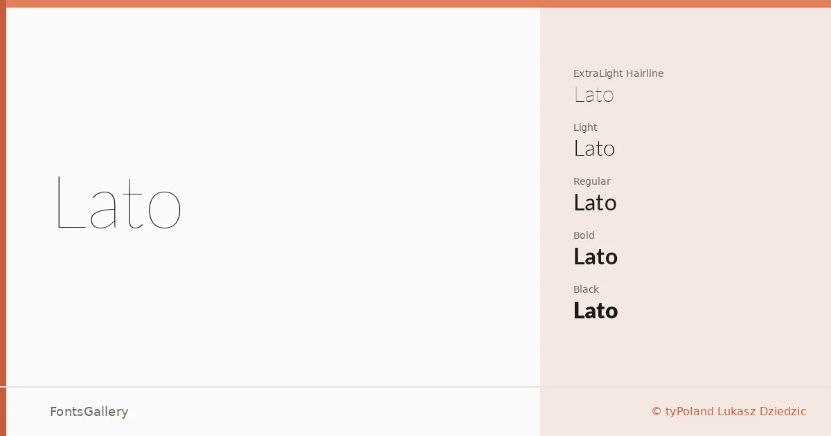
About Lato Font
The name means "Summer" in Polish, and it was drawn in exactly that season by Lukasz Dziedzic of tyPoland Lukasz Dziedzic. What makes this sans serif worth examining is the tension it holds quietly in place: classical uppercase proportions that carry genuine harmony and elegance, set against a sleek, contemporary silhouette that never chases a trend. Semi-rounded details give the letterforms a trace of warmth; the underlying structure keeps everything grounded and serious.
Design Aesthetics & Character Characteristics
The family spans ten styles — Hairline and Hairline Italic, Light and Light Italic, Regular and Regular Italic, Bold and Bold Italic, Black and Black Italic — delivered as TTFs. That range, from barely-there to emphatic, is where the design's thinking becomes clear: at text sizes it reads almost transparently, stepping aside for content, while at display sizes the subtle quirks in the letterforms begin to surface. The overall mood sits comfortably in classic, minimal, and modern territory simultaneously, which is not as easy to pull off as it sounds.
Recommended Usage & Font Pairing
The weight range and that quality of quiet authority make it well-suited to branding systems, business cards, magazine layouts, presentations, and website headers — contexts where professionalism cannot look stiff. Latin script is supported. For pairing, the family has been paired with Aresink, Ballmain, 321 Impact, Bizantheum, and Batoshi, giving you options from expressive display faces to complementary text companions depending on the job.
License & Usage Terms
Lato is released under the SIL Open Font License, Version 1.1, which allows commercial use freely; the font may also be embedded with installable permissions. Note that "Lato" is a Reserved Font Name under the terms of that license.