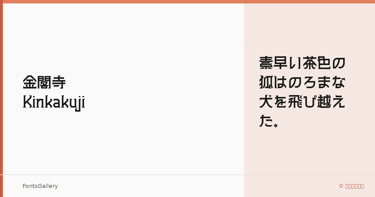
About Kinkakuji Font
There is a particular confidence in these strokes — clean terminals, minimal ornamentation, and a structural economy that reads equally well at display sizes and in tight typographic hierarchies. Hiroki-Chan of もじワク研究 designed this sans serif with deliberate restraint, and that restraint is what gives it authority. The family covers Han, Hiragana, and Katakana, making it a serious choice for Japanese-language work rather than a Latin face with a few borrowed characters bolted on.
Design Aesthetics & Character Characteristics
The family ships in a single weight — Bold Normal — which means it arrives committed to presence rather than offering a range of compromises. That single cut sits in a space between modern geometric and professional corporate: minimal enough for contemporary branding, weighted enough to hold a poster without shouting. Available in TTF, OTF, WOFF, and WOFF2, it is ready for both desktop layout work and web deployment without conversion friction.
Recommended Usage & Font Pairing
The natural home for this family is wherever the headline has to carry real weight — poster campaigns, website headers, wordmarks, and brand identity systems that need a Japanese-capable display face with a modern edge. For pairing, the contrast of Canela's editorial warmth or Armelie's script personality works well against the geometric cool here; for a harder, more graphic pairing, Kactigona or AQUA push the composition in a bolder direction, and Minecraft offers a distinctly stylized counterpoint when the brief calls for it.
License & Usage Terms
Kinkakuji is available for commercial use, and embedding is permitted at an editable level — confirm the full terms at the license page before finalizing any project deliverables.