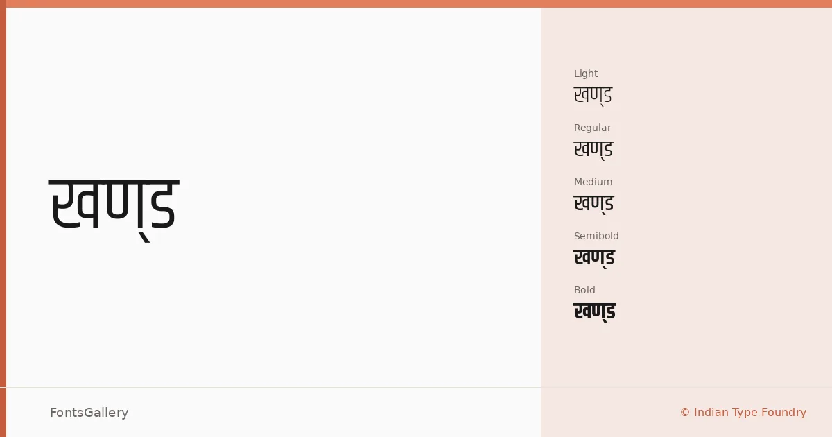
About Khand Font
There is something quietly disciplined about the way these letterforms sit on the page — condensed enough to feel purposeful, open enough to stay legible under pressure. Khand was designed at the Indian Type Foundry, with Sanchit Sawaria and Jyotish Sonowal responsible for the Devanagari side and Satya Rajpurohit handling the Latin. The result is a dual-script family that treats both writing systems with equal seriousness rather than bolting one onto the other as an afterthought.
Design Aesthetics & Character Characteristics
This is a sans-serif built around minimal geometry and professional restraint — modern in the way that good information design is modern, not in the way of chasing trends. The family runs from Light through Bold, giving you five weights — Light, Regular, Medium, SemiBold, and Bold — that hold their character consistently across the range. At display sizes the forms read as sharp and authoritative; at smaller settings they retain that same composure without tightening up. All files are delivered as TTFs with installable embedding permissions.
Recommended Usage & Font Pairing
The weight range and dual Latin-Devanagari coverage make this a natural choice for branding, editorial headlines, website headers, magazine layouts, and logo work that needs to function across both scripts without compromise. It pairs well with Canela, ABC Arizona, and Armelie when you want serif contrast, and with 321 Impact or Kactigona when the brief calls for something with more graphic weight.
License & Usage Terms
Khand is released under the SIL Open Font License, Version 1.1, which permits commercial use — full terms and the accompanying FAQ are available at http://scripts.sil.org/OFL.