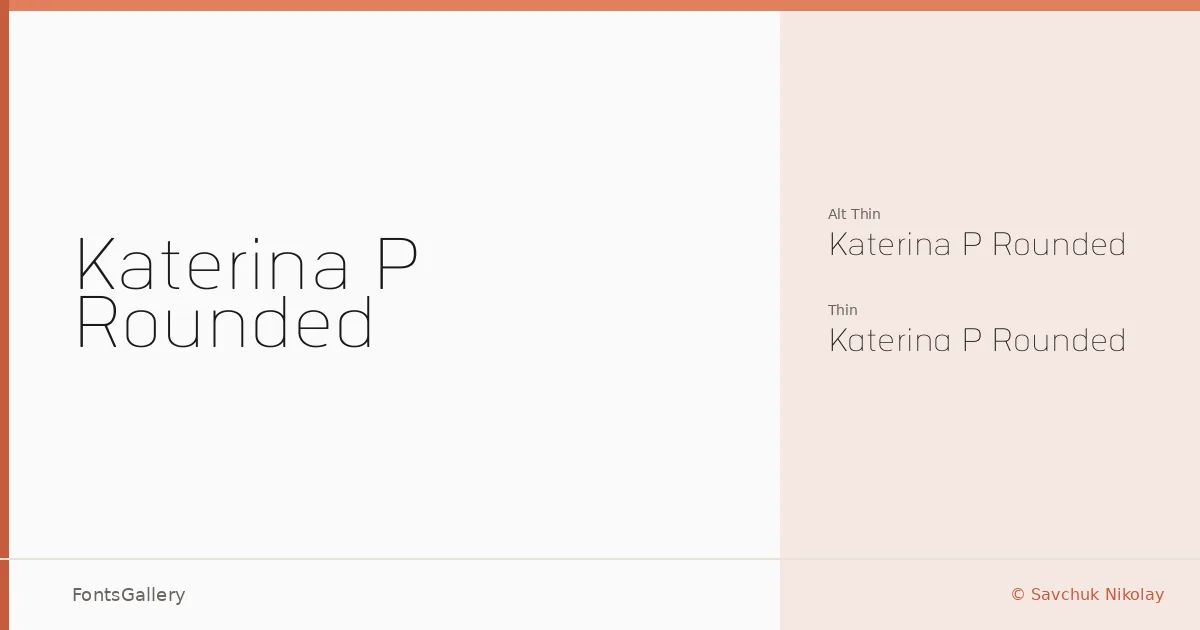
About Katerina P Rounded Font
There is a deliberate lightness to this sans serif — the rounded terminals soften what could otherwise be a stark geometric construction, giving each letterform a quiet, polished finish. It was designed by Savchuk Nikolay and arrives in two Thin cuts: the standard Thin and an Alt Thin variant that offers subtle alternates for those moments when a headline needs a slightly different texture.
Design Aesthetics & Character Characteristics
Both styles sit at the hairline end of the weight spectrum, which makes the family feel inherently minimal and refined rather than neutral. The rounded stroke endings pull it away from cold precision toward something warmer and more considered — a quality that reads well in elegant, modern contexts. Available in TTF format, the two cuts together give you enough variation to build a typographic system around a single, consistent voice. Latin character coverage keeps things focused and clean.
Recommended Usage & Font Pairing
The thinness and refinement here suit branding work, logo lockups, and magazine headers where white space does the heavy lifting alongside the type. Business card design and website headers are natural fits — anywhere the letterforms need to hold their own at a large size without crowding the layout. For pairing, the contrast of Canela's editorial serif or the expressive strokes of Armelie would work well against these thin rounds, while ABC Arizona offers a cooler, more structured counterpart for brand systems that need a second voice.
License & Usage Terms
This family is offered under Personal Use terms, which means commercial use is not permitted — confirm directly with Savchuk Nikolay before placing it in any client or revenue-generating work. Embedding is limited to preview and print only.