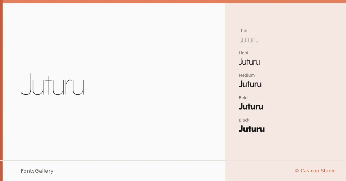
About Juturu Font
There is a quiet confidence to this sans serif from the Casloop Team — the kind that comes from restraint rather than decoration. Across its nine weights, from Thin through Black, the letterforms hold a consistent geometry without feeling mechanical. Casloop Studio built something that earns its place in considered design work.
Design Aesthetics & Character Characteristics
The family runs a full weight range — Thin, ExtraLight, Light, Regular, Medium, SemiBold, Bold, ExtraBold, and Black — all delivered as OTF files, which keeps things clean for print and layout workflows. The mood is elegant and minimal, with a professional posture that doesn't tip into coldness. Lighter cuts feel airy and editorial; the heavier weights carry enough mass to anchor a composition without shouting.
Recommended Usage & Font Pairing
The weight range makes it well-suited to branding systems, magazine layouts, and website headers, where you need one family to carry both a fine introductory line and a bold headline. It covers Latin script. For pairing, the contrast of a serif like Canela adds warmth against the geometric neutrality here, while display faces such as Urban Thunder Demo or Kactigona introduce texture and energy. AQUA and Armelie round out the options for projects that need something softer alongside it.
License & Usage Terms
Juturu is released under a Personal Use license — commercial use is not permitted, so confirm the terms with Casloop Studio before committing it to a client job. Embedding is set to installable.