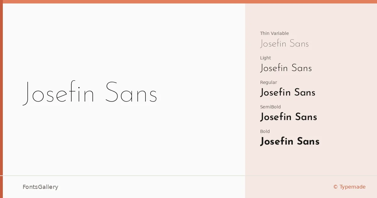
About Josefin Sans Font
There is something immediately composed about this geometric sans-serif — the letterforms sit with an almost architectural stillness, each character built from clean strokes and low contrast that feel deliberately considered rather than merely neutral. It comes from Santiago Orozco at Typemade, and the family spans Thin through Bold across both upright and italic cuts, plus a variable axis that covers the full weight range in a single file.
Design Aesthetics & Character Characteristics
The overall mood reads as classic and minimal at once — modern in its geometry, but with enough elegance to avoid feeling cold. The full set runs from Thin Variable and Thin Variable Italic through ExtraLight, Light, Regular, Medium, SemiBold, and Bold, each with a matching italic, giving you fine control over typographic hierarchy. At lighter weights the letters feel airy and editorial; the Bold holds its own as a display face without losing the family's inherent restraint. TTF files keep the package broadly compatible across workflows.
Recommended Usage & Font Pairing
The family earns its place in branding, logo work, magazine layouts, and website headers — anywhere that calls for a headline face with genuine poise rather than loud personality. Latin and Latin Extended (partial) coverage handles most Western European copy, and Vietnamese support extends its reach for multilingual projects. It pairs well with Aresink, Ballmain, 321 Impact, Bizantheum, and Batoshi, all of which offer enough contrast in texture or weight to keep a layout from feeling monochromatic.
License & Usage Terms
Released under the SIL Open Font License, Version 1.1, which explicitly allows commercial use — full terms and FAQ are at http://scripts.sil.org/OFL. Embedding is set to installable, so you can distribute documents with the fonts embedded without restriction.