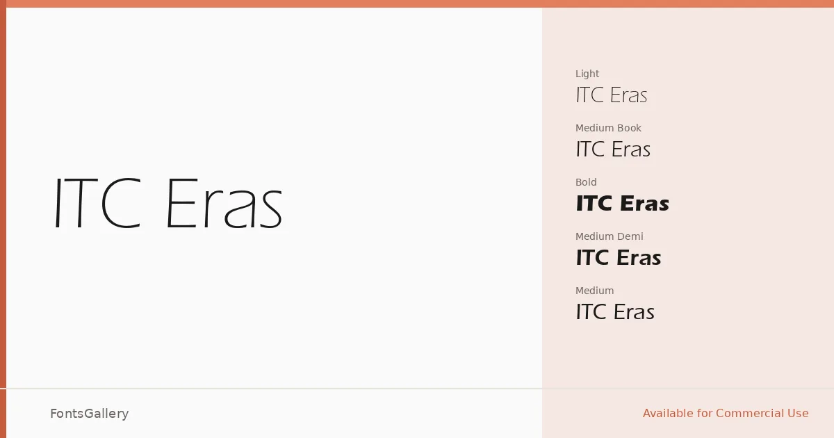
About ITC Eras Font
There is something quietly assured about this sans serif — the letters sit forward on the baseline with a subtle forward lean, giving lines of text a composed, directional energy that feels neither cold nor casual. The six-style family spans Light through Ultra, with Book, Demi, and Medium filling out the middle range, all delivered as OTF files. Latin script coverage is clean and consistent across every cut.
Design Aesthetics & Character Characteristics
The design sits firmly in the modern, minimal end of the sans serif spectrum — strokes are humanist enough to stay readable but geometric enough to read as professional and elegant. Light is genuinely airy, Ultra carries real weight without distorting the letterforms, and the gradations between Book, Demi, and Medium give you fine control over typographic hierarchy. Nothing here shouts; the authority is built into the proportions.
Recommended Usage & Font Pairing
The family earns its keep in branding, logo work, magazine headlines, and business card typography — anywhere the job calls for a sans that reads as considered rather than generic. Paired alongside Aresink, Ballmain, 321 Impact, Bizantheum, or Batoshi, it holds its own without competing for attention, making those combinations worth exploring for editorial and identity projects alike.
License & Usage Terms
ITC Eras is available for commercial use, and the fonts carry installable embedding permissions, meaning they can be embedded in documents and distributed without restriction under those terms.