About Inter Font
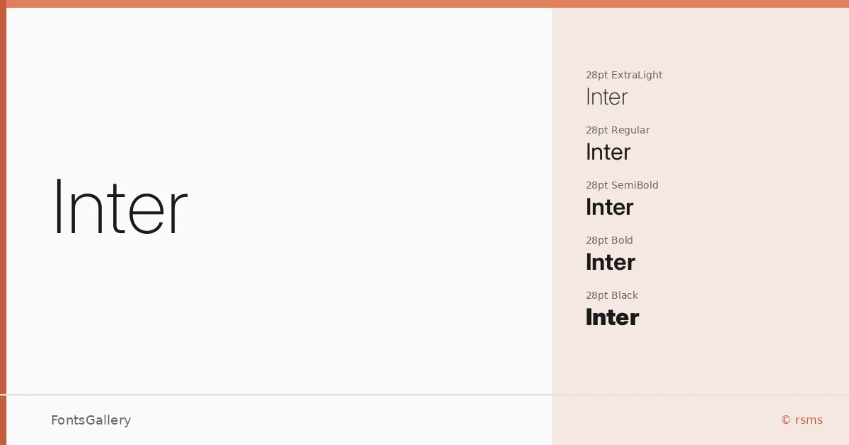
Rasmus Andersson designed this typeface with screens squarely in mind — the letterforms carry a tall x-height, open apertures, and carefully considered spacing that keeps text readable at the small sizes digital interfaces demand. It covers Latin, Latin Extended, Vietnamese, Cyrillic, and Greek, making it genuinely useful across a wide range of multilingual projects. The family is available in TTF format.
Design Aesthetics & Character Characteristics
The overall feeling is clean and rational: a modern geometric sans serif that stays out of its own way. The weight range runs from Thin and ExtraLight through Light, Regular, Medium, SemiBold, Bold, ExtraBold, and Black — each available in upright and italic, across optical size cuts at 18pt, 24pt, and 28pt, plus variable font files that let you move continuously across the full weight and angle spectrum. That range gives layouts real room to build hierarchy without reaching for a second face. The mood lands firmly in the minimal and professional zone, which suits the minimal and professional demands of business and editorial work alike.
Recommended Usage & Font Pairing
It handles branding systems, presentation decks, magazine layouts, website headers, and business cards with equal composure — anywhere a neutral, confident sans needs to carry a lot of text at varying sizes. For contrast-driven pairings, the family works well alongside Canela, Armelie, 321 Impact, AQUA, and Kactigona, each offering a different kind of counterpoint, from warm serif warmth to expressive display energy.
License & Usage Terms
Inter is released under the SIL Open Font License, Version 1.1, which allows commercial use freely; full terms and the accompanying FAQ are available at https://openfontlicense.org. Embedding is permitted at the installable level.