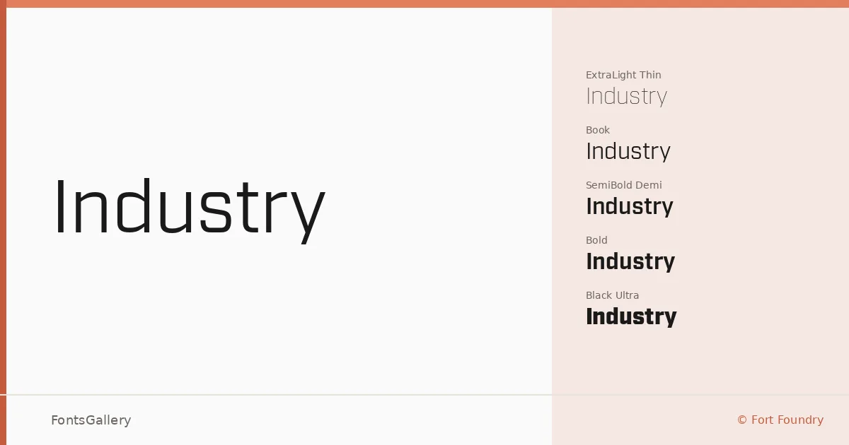
About Industry Font
There is a particular confidence to the stroke construction here — squared, taut, and deliberately mechanical without tipping into cold territory. Mattox Shuler at Fort Foundry drew this sans with a clarity that reads well under pressure: at large scale, at tight spacing, in contexts that demand authority. The forms sit somewhere between geometric restraint and humanist accessibility, which is what keeps them useful across very different briefs.
Design Aesthetics & Character Characteristics
The family runs from Thin and Thin Italic all the way through Ultra and Ultra Italic — sixteen styles in total, covering every stop from delicate counterweight to heavy black mass. Each weight comes with a corresponding italic, which means you have real typographic range rather than just a display tool. The overall register is modern and minimal, with a professional firmness that holds up in both headline-scale settings and tighter logo lockups. OTF files throughout.
Recommended Usage & Font Pairing
The family is built for work that needs to project: advertising campaigns, signage systems, brand identities, and headline hierarchies where weight contrast does the heavy lifting. The extreme weights hit hard in logo and display work; the lighter cuts — Thin through Book — give you room to build editorial texture. For pairing, the foundry recommends it alongside Canela, Armelie, 321 Impact, AQUA, and Kactigona, covering combinations from high-contrast serif warmth to expressive script contrast.
License & Usage Terms
This family is offered under a Demo license, which means personal-use terms apply — confirm licensing directly with Fort Foundry before committing it to any commercial job. Embedding is permitted at editable level.