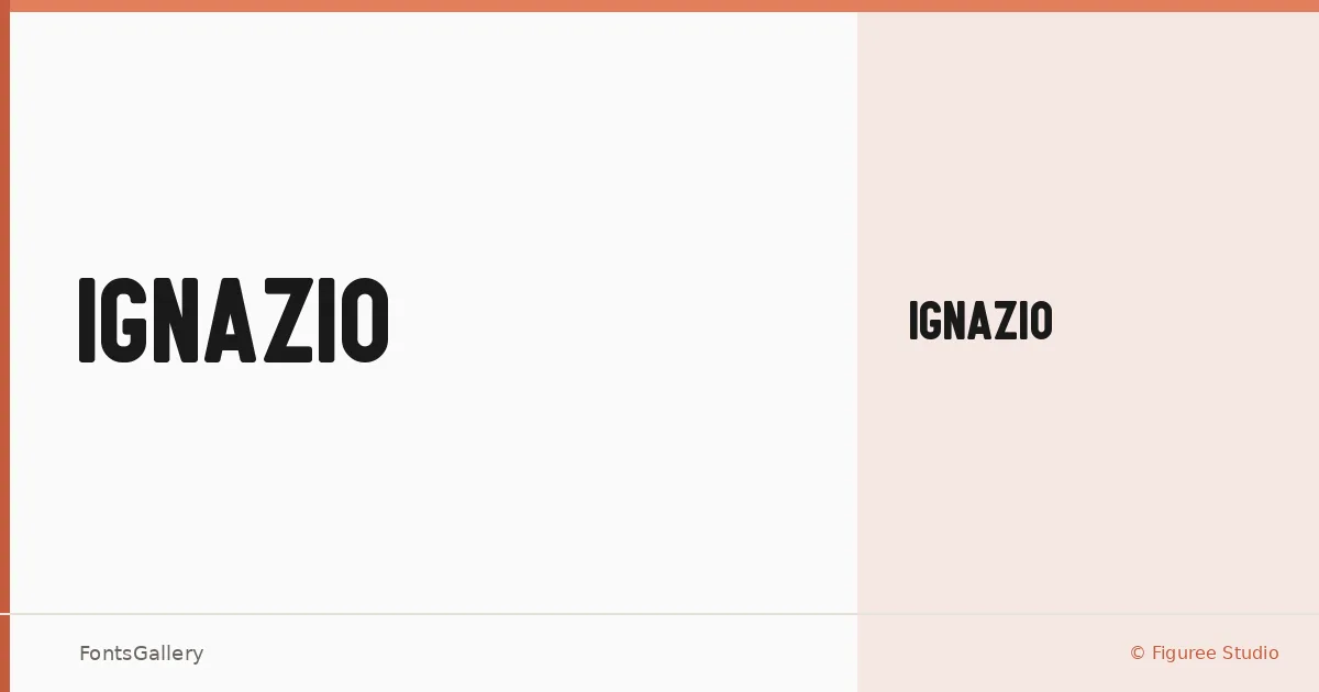
About Ignazio Font
There is a deliberate restraint to this sans serif — clean terminals, confident spacing, and a geometry that never tips into coldness. Icep Anwar Fadhil at Figuree Studio released it in 2020, and the result is a single-weight display face that earns its place in professional work through clarity rather than decoration.
Design Aesthetics & Character Characteristics
The family ships as one cut — Ignazio Reguler — in TTF format, and that singular focus keeps the design honest. The mood sits squarely in minimal and modern territory: strokes are even, proportions are generous, and nothing competes with the message you set in it. It reads as bold in character even at a regular weight, which makes it well suited to headlines that need authority without visual noise.
Recommended Usage & Font Pairing
The face is built for large-scale work — think poster hierarchies, logo lockups, advertising headlines, and branding systems where Latin text needs to hold up at display sizes. It pairs naturally with contrasting companions: the editorial softness of Canela, the script energy of Armelie, the handcrafted weight of Urban Thunder Demo, the cleanness of AQUA, or the geometry of Kactigona all offer productive contrast depending on the register of a project.
License & Usage Terms
Ignazio is offered under Personal Use terms, which means commercial use is not permitted — confirm licensing with Figuree Studio before committing it to any client or revenue-generating work. Embedding is set to installable.