About Hurme Geometric Sans Font
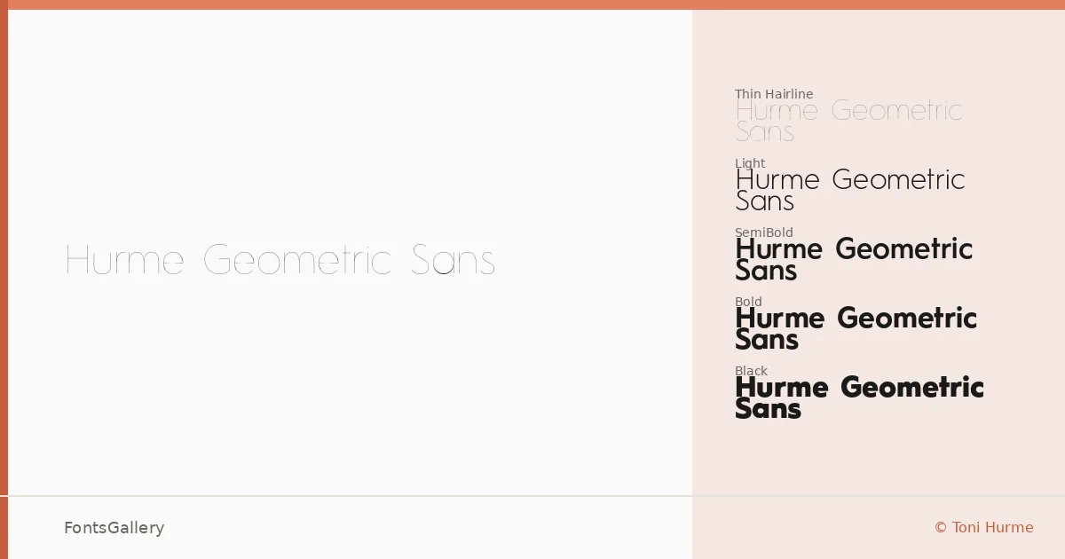
There is a quiet confidence to these letterforms — circular bowls, even stroke weights, and just enough optical correction to keep things from feeling mechanical. Toni Hurme built this family around the geometric sans tradition, but the result reads as considered rather than cold. The copyright dates to 2012, and the craft holds up.
Design Aesthetics & Character Characteristics
The family runs from Hairline and Hairline Oblique all the way through Thin, Light, Regular, SemiBold, Bold, and Black — each weight paired with a matching oblique — fourteen cuts in total, all delivered as OTF. That range gives you genuine tonal control: the Hairline almost disappears into a layout while the Black lands with real authority. The mood sits squarely in minimal and modern territory, professional without being anonymous, and the obliques maintain the same geometric discipline as their upright counterparts rather than leaning into anything casual.
Recommended Usage & Font Pairing
The weight range makes it well-suited to branding systems, editorial headlines, magazine folios, logo lockups, and website headers — anywhere Latin-script copy needs to carry structural clarity at a glance. For pairing, the family works alongside AQUA, Ballmain, 321 Impact, Aranea, and Batoshi, each offering enough contrast in texture or proportion to complement the geometric neutrality here.
License & Usage Terms
This family is available under Personal Use terms — commercial use is not permitted, so confirm your licensing situation before taking it into a client job. Embedding is restricted to preview and print only.