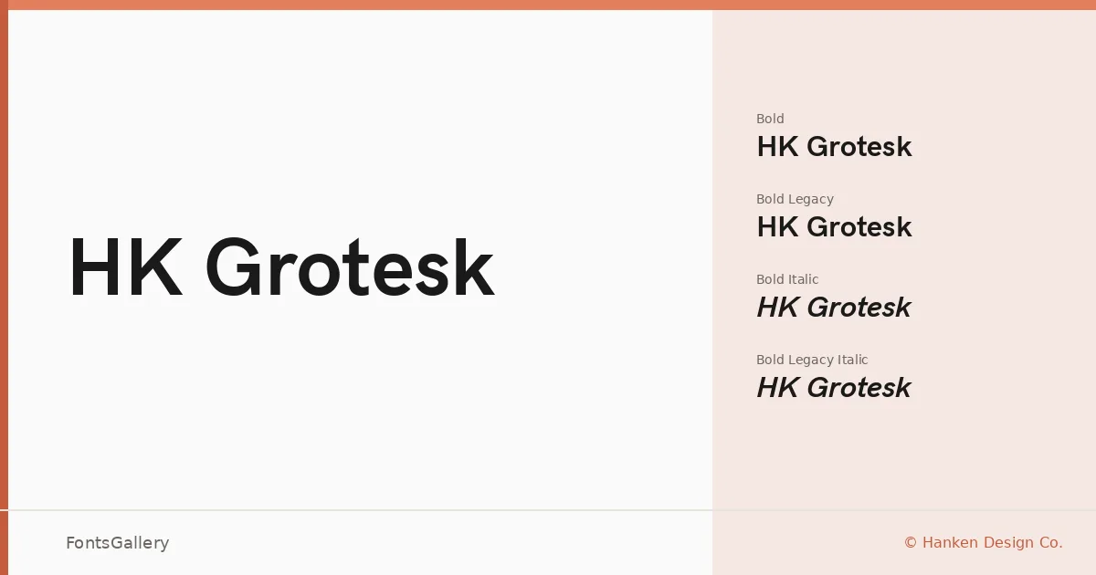
About HK Grotesk Font
There is a particular kind of clarity to a well-drawn grotesque — the kind where nothing calls attention to itself, yet every letter feels considered. Alfredo Marco Pradil of Hanken Design Co. drew exactly that: a clean, low-contrast sans with open apertures and a rhythm that sits comfortably at small text sizes and large display settings alike. The result has a quiet confidence that owes something to the mid-century European grotesque tradition without leaning on nostalgia.
Design Aesthetics & Character Characteristics
The family spans Light through Bold, each weight available in Regular, Italic, and a Legacy variant — twenty cuts in total, delivered in TTF, OTF, EOT, WOFF, and WOFF2. The Legacy styles preserve earlier spacing and glyph decisions, useful when you need to maintain consistency with documents set in an older version. Across all cuts the mood is minimal and professional: strokes are even, geometry is restrained without being cold, and the overall texture reads as modern without feeling fashionable.
Recommended Usage & Font Pairing
It earns its keep in branding systems, presentations, website headers, business cards, and editorial layouts where a neutral but characterful sans needs to anchor the page. Latin coverage is solid, with partial Vietnamese support added for broader reach. For contrast in editorial or brand work, the family pairs well with Canela, ABC Arizona, Armelie, and Kactigona; for something more unexpected, Minecraft brings a hard-edged counterpoint to its smooth strokes.
License & Usage Terms
Released under the SIL Open Font License (OFL), Version 1.1, commercial use is permitted and the fonts may be embedded with editable permissions. The Reserved Font Name is HK Grotesk; full license terms are at http://scripts.sil.org/OFL.