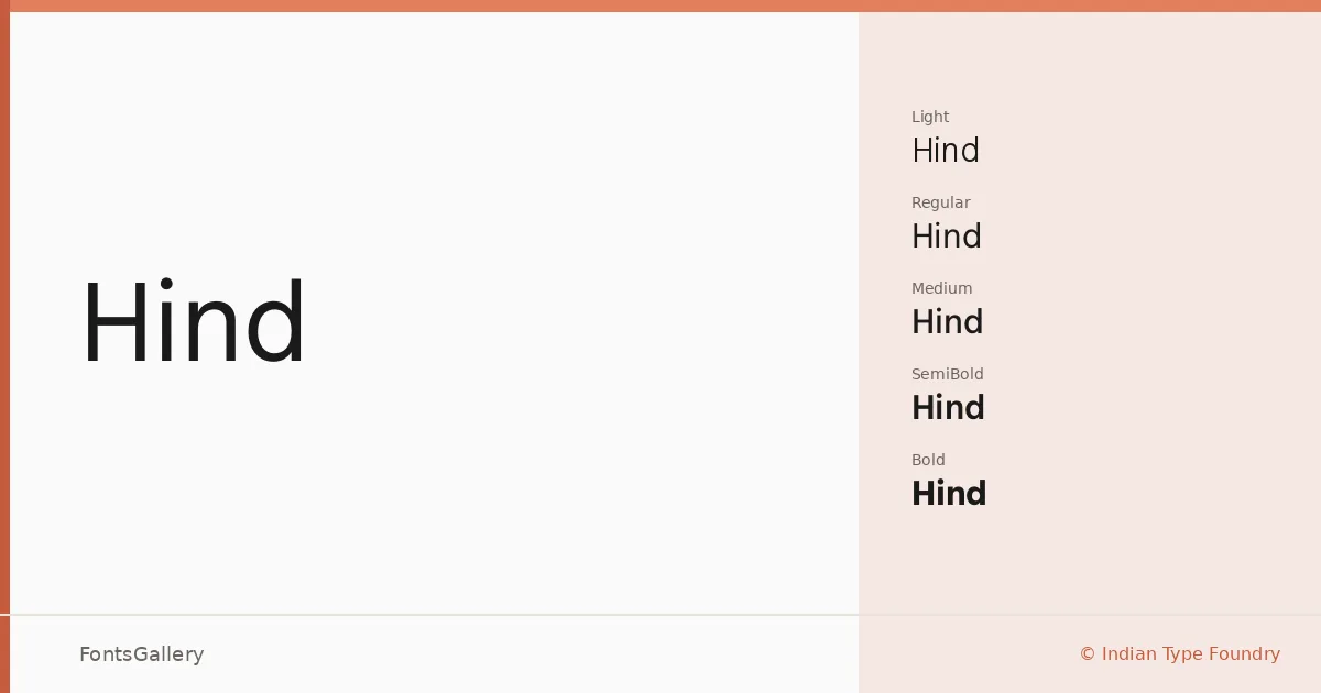
About Hind Font
There is a quiet confidence to these letterforms — the kind that comes from careful engineering rather than decoration. Designed by Manushi Parikh and Satya Rajpurohit at Indian Type Foundry, and subsequently re-engineered by Rahul Gajjar, this Latin sans serif carries the measured precision you would expect from a foundry that thinks seriously about how type functions at scale.
Design Aesthetics & Character Characteristics
The family spans five weights — Light, Regular, Medium, SemiBold, and Bold — delivered in both TTF and OTF formats, with a variable Light option that gives you fine-grained control at the lighter end of the range. The forms sit squarely in the modern, minimal tradition: open apertures, even stroke contrast, and a professional restraint that keeps text readable whether it is set small in a business card grid or large across a website header. Nothing here competes with the content.
Recommended Usage & Font Pairing
The range of weights makes it well suited to branding systems, magazine layouts, presentations, and digital interfaces where hierarchy needs to be built from within a single family. When you do want contrast from a second typeface, it pairs naturally with the editorial warmth of Canela, the script energy of Armelie or Kactigona, the display personality of AQUA, or the blocky character of Minecraft. Latin script coverage means it is ready for any project drawing on that range of languages.
License & Usage Terms
Hind is released under the SIL Open Font License (OFL), Version 1.1, which permits commercial use — full terms and FAQ are available at http://scripts.sil.org/OFL. Embedding is set to installable, so documents distributed with the font embedded are covered.