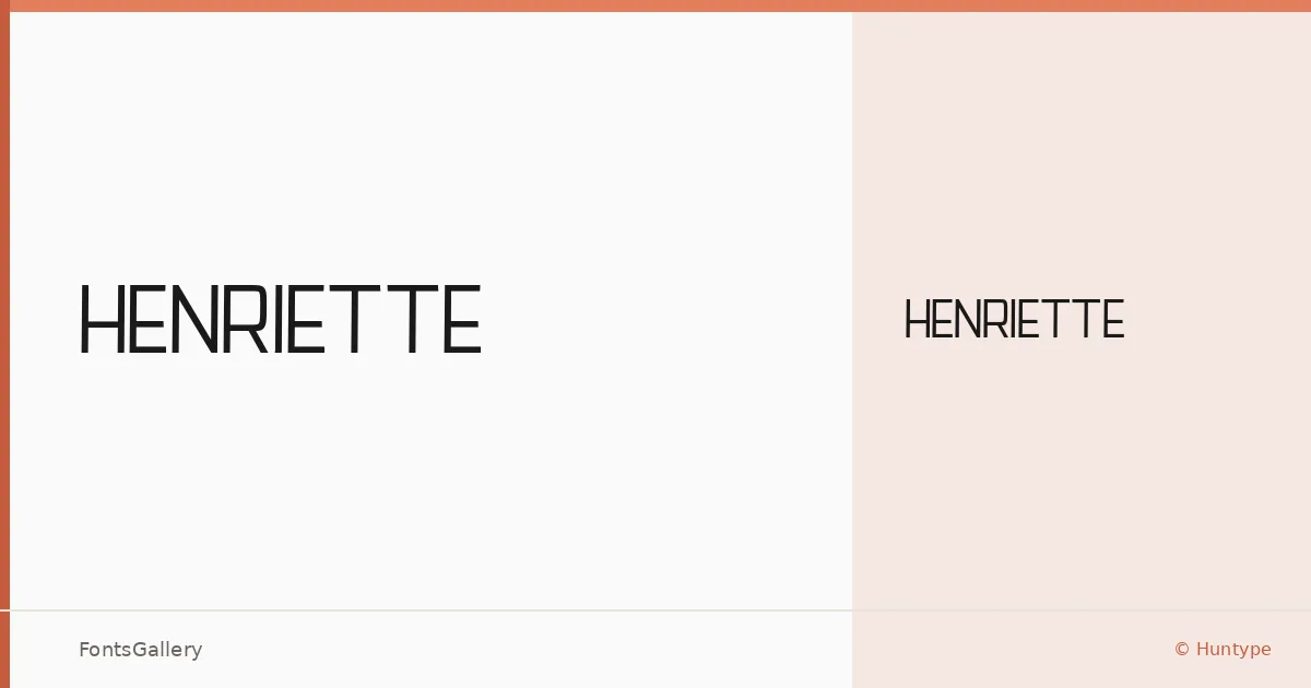
About Henriette Font
There is a quietness to this sans serif that earns attention rather than demanding it. Henriette was designed by Mas Anis under the Huntype foundry, and the single Regular weight is built with a restraint that keeps the letterforms clean and unhurried — the kind of geometry that reads as considered rather than cold.
Design Aesthetics & Character Characteristics
The family sits squarely in the modern sans serif tradition, carrying an elegant, minimal character that suits editorial and identity work equally well. With one Regular cut available in both TTF and OTF formats, there is no weight range to navigate — what you get is a single, well-defined voice. The forms feel professional without stiffness, the sort of type that holds its composure at large sizes without losing warmth entirely.
Recommended Usage & Font Pairing
It is most at home in headline roles — magazine covers, poster hierarchies, brand marks, and logo lockups where a single strong word needs to carry the frame. For pairing, the family has been tested alongside Canela, Armelie, 321 Impact, AQUA, and Kactigona, giving you contrasting options from editorial serifs to decorative display faces depending on the tone of the project.
License & Usage Terms
This family is released under a Personal Use license — free for personal use, but commercial use is not permitted under these terms, so confirm clearance with Huntype before taking it into a paid project. Embedding is set to installable.