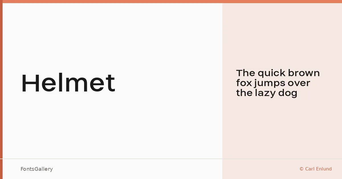
About Helmet Font
There is a particular kind of confidence in a sans serif that refuses to fuss — clean terminals, deliberate spacing, nothing apologizing for itself. This is what Carl Enlund built here: a single-weight Latin display face that carries its minimal geometry without any decorative compromise.
Design Aesthetics & Character Characteristics
The family ships as a single Regular cut in TTF format, which keeps things honest — the design earns its weight through proportion rather than variety. The mood sits firmly in bold and modern territory: strokes feel considered rather than mechanical, and the overall tone reads as professional without tipping into corporate stiffness. At large sizes, the letterforms hold their structure well, which is exactly where a minimal sans needs to prove itself.
Recommended Usage & Font Pairing
This is a headline and display face first — think masthead treatments, logo lockups, website headers, and branding systems where a single strong voice needs to anchor the layout. Its Latin coverage covers the expected range for Western European editorial and commercial work. For contrast in a type system, it pairs naturally with the editorial softness of Canela, the calligraphic flow of Allura, the raw punch of 321 Impact, the refined structure of Anglecia Pro, or the elegance of Ballmain.
License & Usage Terms
Released under the SIL Open Font License, Version 1.1, this family is cleared for commercial use, and the embedding permission is set to installable — full details at http://scripts.sil.org/OFL.