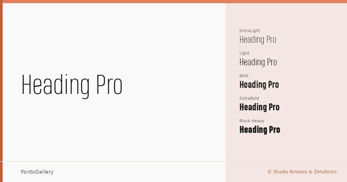
About Heading Pro Font
There is a quiet confidence in the way this sans-serif carries weight across its range — from a barely-there Thin to a commanding Heavy — without ever resorting to quirk or decoration. Francesco Canovaro designed it for Studio Kmzero & Zetafonts, and the result is a family built around disciplined geometry and clean optical spacing. The letterforms stay neutral under pressure, which is exactly what display text demands.
Design Aesthetics & Character Characteristics
The family spans fifteen styles: ExtraLight and ExtraLight Italic through Thin, Light, Book, Regular, Bold, ExtraBold, and Heavy, each accompanied by a matching Italic. That breadth gives you genuine tonal range within a single system. The mood throughout is modern and minimal — strokes are even, terminals are cut with precision, and nothing competes with the words themselves. Available in TTF, it covers Latin, Cyrillic, and Greek, making it a practical choice for multilingual editorial and branding work.
Recommended Usage & Font Pairing
The family was built for headline use: magazine covers, poster hierarchies, website headers, and branding systems where a clean, professional voice is non-negotiable. Lighter weights handle refined editorial moments; the Heavy end commands large-format display. It pairs well with Canela for a high-contrast serif counterpoint, with Armelie for a more expressive contrast, or with Kactigona, AQUA, and Minecraft when the project calls for something with more character in the body or accent role.
License & Usage Terms
This download is offered under a Demo license, which permits personal and non-commercial use only — individual use, not corporate or studio entities — so confirm before committing it to any commercial project; commercial licenses are available directly from Zetafonts at www.zetafonts.com/licensing.