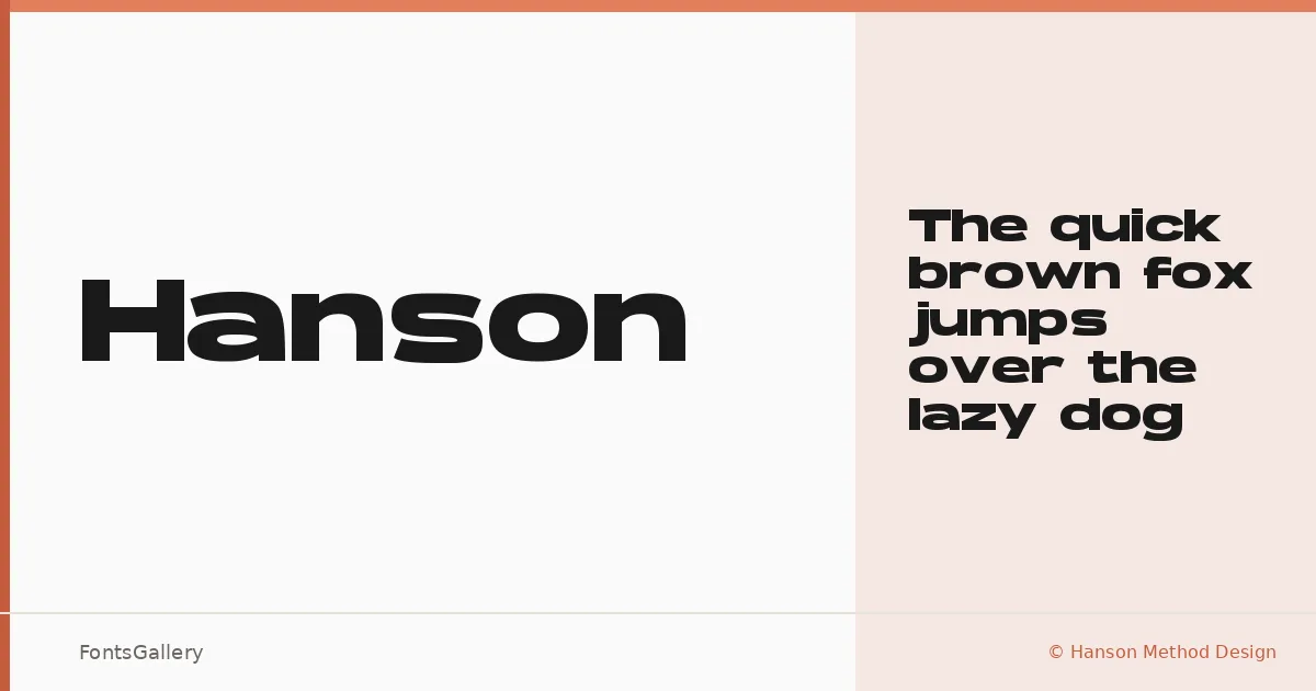
About Hanson Font
There is a deliberate heaviness to this sans serif — the kind of weight that reads as intention rather than accident. It comes from Finn Hanberg of Hanson Method Design, a studio built around the visual side of brand identity, and it exists in a single cut: Bold. That singularity is a design statement in itself.
Design Aesthetics & Character Characteristics
The family sits squarely in the modern sans serif camp, built for impact at large sizes. Bold by category and by character, it carries a professional confidence that suits headline work without feeling corporate or cold. Delivered as a TTF, the single Bold weight is unambiguous about what it wants to do: command attention in display contexts where Latin-script copy needs to land hard.
Recommended Usage & Font Pairing
The natural territory here is branding, logo lockups, posters, and advertising headlines — anywhere the type needs to carry a visual anchor. For body text or secondary typographic layers, the listed pairing families cover a useful range: Canela brings editorial warmth, ABC Arizona adds refined structure, Armelie offers contrast in style, 321 Impact keeps things punchy, and Kactigona introduces an expressive counterpoint. Any of those combinations give you room to build out a full typographic system around this Bold centerpiece.
License & Usage Terms
This family is available under Personal Use terms following a Creative Commons model — please give credit to the author, and confirm clearance directly with Hanson Method Design before committing it to any commercial job.