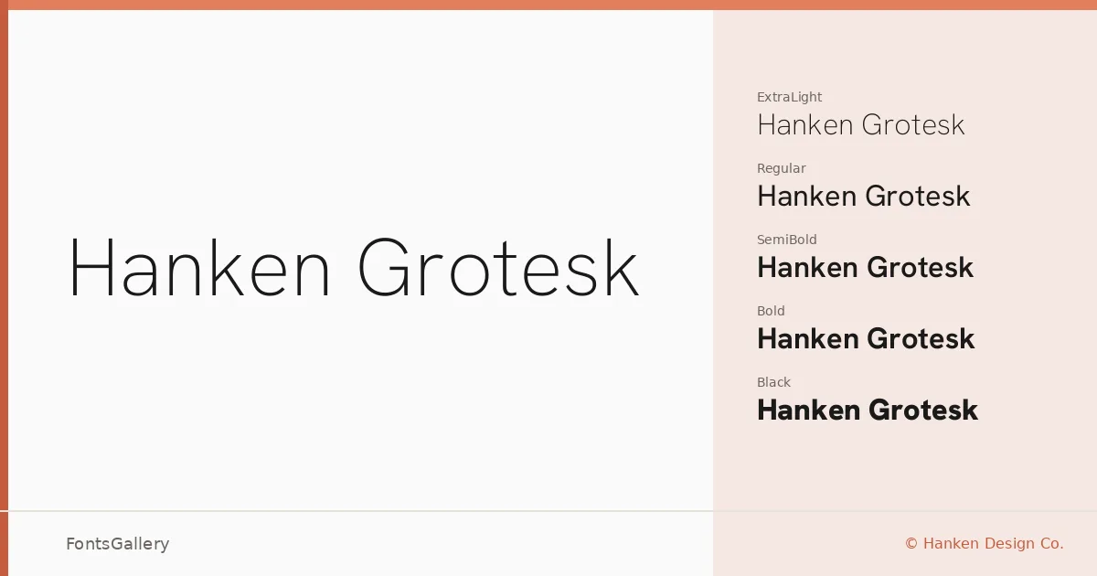
About Hanken Grotesk Font
There is a particular steadiness to this grotesque — clean terminals, controlled stroke contrast, and a geometry that never tips into coldness. Designed by Alfredo Marco Pradil at Hanken Design Co., it sits in that productive middle ground where classic grotesque tradition meets contemporary minimalism without nostalgia or novelty for their own sake.
Design Aesthetics & Character Characteristics
The family spans Thin through Black, with a full italic companion at every weight and variable fonts included — so the range from hairline delicacy to heavy authority is genuinely continuous rather than just implied. The overall mood is modern and professional, carrying the kind of restrained character that reads well at caption size and holds composure at display scale. TTF files are provided throughout, and the variable format gives you fluid weight control in environments that support it.
Recommended Usage & Font Pairing
The clean structure makes it a natural fit for branding systems, business cards, magazine layouts, presentations, and website headers — anywhere a professional, minimal voice needs to sustain itself across many contexts. Latin and Vietnamese are both supported, which extends its reach for multilingual editorial and digital work. It pairs thoughtfully with serif and display faces like Canela and ABC Arizona for contrast-driven layouts, and sits alongside Armelie, Kactigona, or 321 Impact when a job calls for something with more expressive personality against a neutral backbone.
License & Usage Terms
Released under the SIL Open Font License, Version 1.1, which allows commercial use — full terms and FAQ are available at https://scripts.sil.org/OFL. Embedding is permitted at the installable level.