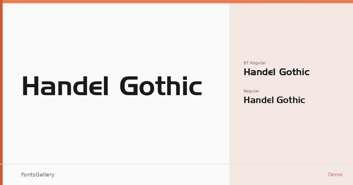
About Handel Gothic Font
There is something unmistakably aerodynamic about these letterforms — rounded terminals clipped into near-geometric precision, capitals that feel like they belong on a spacecraft panel or a stadium scoreboard. The copyright trace this back to Bitstream's work between 1990 and 2001. Two cuts are available in TTF format: Handel Gothic BT Regular BT Regular and Handel Gothic Regular Regular.
Design Aesthetics & Character Characteristics
This is a sans serif built around a futuristic, modern sensibility that leans confidently bold without resorting to aggressive weight. The rounded yet structured geometry gives it a professional quality — clinical enough for institutional use, distinctive enough for branding work. At display sizes the letters command space with the kind of quiet authority that works well in headline and signage contexts. Latin script is supported.
Recommended Usage & Font Pairing
It earns its keep at large scales: poster headlines, logo lockups, and exterior signage are where the design logic becomes most legible. For contrast in layout work, the listed pairing families run an interesting range — the editorial softness of Canela or ABC Arizona can offset the hard geometry here, while something like Angeletta brings a calligraphic warmth that plays well against it. Armelie and Minecraft offer their own tonal contrasts depending on how playful or structured the project needs to be.
License & Usage Terms
This family is available under a Demo license with restricted embedding permissions, which means it is limited to personal-use evaluation — confirm licensing terms with the rights holder before applying it to any commercial job.