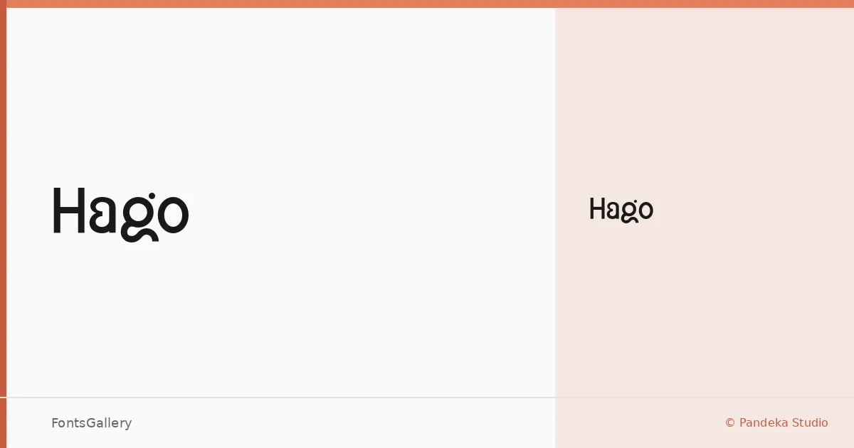
About Hago Font
There is a particular kind of restraint in this sans serif — the kind that comes from deliberate reduction rather than indifference. Designed by Sagara Nararya for Pandeka Studio, Hago arrives as a single Regular weight in OTF format, and it earns that economy by making every curve and terminal count. The letterforms sit in that clean, minimal register where geometry and warmth coexist without either one overreaching.
Design Aesthetics & Character Characteristics
The overall character is modern and professional, with an elegance that reads as intentional rather than decorative. A single Regular cut keeps the focus squarely on the forms themselves — there are no weight variations to fall back on, so the design has to hold up through spacing, proportion, and the confidence of its strokes alone. It does. The mood is contemporary without being cold, which is harder to pull off than it sounds.
Recommended Usage & Font Pairing
This is a face built for high-visibility settings: brand identities, logotypes, poster headlines, and social media graphics where a clean, minimal presence carries authority at a glance. When you need a contrast in texture, it pairs well with the editorial softness of Canela, the script warmth of Armelie, the energy of Urban Thunder Demo, the geometric clarity of AQUA, or the structural weight of Kactigona — a pairing list that covers a wide range of tonal directions.
License & Usage Terms
Hago is released under a Demo license, which covers personal use only — confirm licensing terms directly with Pandeka Studio before deploying it in any commercial project. Embedding is permitted at the installable level.