About Ghost Font
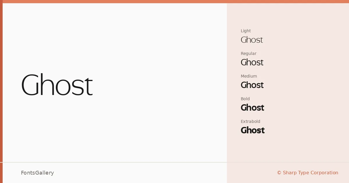
There is a particular kind of restraint in this sans serif that earns its keep immediately — clean strokes held at exactly the right tension, neither cold nor warm, just present. Lucas Sharp and My-Lan Thuong at Sharp Type Corporation built it with the kind of deliberateness you feel in the spacing as much as the letterforms themselves. The result is a face that reads with quiet authority across a wide range of weights.
Design Aesthetics & Character Characteristics
The family runs from Light through ExtraBold, each with a companion italic, giving you ten cuts in total — Light, Light Italic, Regular, Italic, Medium, Medium Italic, Bold, Bold Italic, ExtraBold, and ExtraBold Italic — available in both TTF and OTF formats. The mood is consistently minimal and elegant, sitting comfortably in the professional-modern register without ever tipping into sterility. The italics carry a gentle obliqueness rather than a dramatic lean, which keeps them useful as workhorse companions rather than decorative accents.
Recommended Usage & Font Pairing
It performs best where refinement matters: brand identities, magazine headlines, website headers, and presentation decks all play to its strengths. The lighter weights feel at home in editorial contexts; the ExtraBold commands attention without shouting. For pairing, the contrast-rich serif Canela works beautifully against it, as does the warmth of Angeletta or Magnolia Script for branding work — and Times New Roman or even the blunt geometry of Minecraft can create productive tension in editorial or mixed-media layouts.
License & Usage Terms
This family is offered under Personal Use terms, which means commercial use is not covered — confirm the appropriate license at sharptype.co/licensing/ before committing it to a client job.