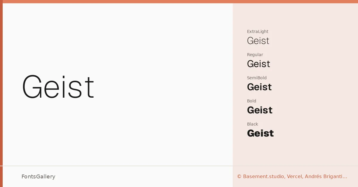
About Geist Font
There is a deliberate quietness to this sans serif — clean strokes, open apertures, and a geometry that never tips into coldness. Designed by Basement.studio alongside Andrés Briganti and Mateo Zaragoza, with Vercel and Guido Ferreyra among the collaborators, it carries the sensibility of a team that builds interfaces as well as typefaces. The result is a face that feels engineered without feeling mechanical.
Design Aesthetics & Character Characteristics
The family spans a wide tonal range: Thin and ExtraLight at one end, through Light, Regular, Medium, SemiBold, Bold, and ExtraBold, up to Black — each with a matching italic — plus Variable and Variable Italic cuts for fine-grained axis control, all delivered as TTF files. The mood throughout is minimal and professional: proportions are measured, spacing is generous, and the italics lean without theatrics. Latin, Vietnamese, and Cyrillic are all supported, making the range genuinely useful across multilingual projects.
Recommended Usage & Font Pairing
It sits naturally in website headers, digital presentations, and brand identity work, where its modern restraint reads as authority rather than austerity. Logo lockups and magazine layouts benefit from the contrast available between Thin and Black. When paired with something that offers warmth or personality — Canela, Angeletta, ABC Arizona, or Armelie for editorial softness; Minecraft for something more expressive and unexpected — the neutrality of this sans becomes an asset rather than a limitation.
License & Usage Terms
Released under the SIL Open Font License (OFL), Version 1.1, with full commercial use permitted and installable embedding rights; details and FAQ are available at https://openfontlicense.org.