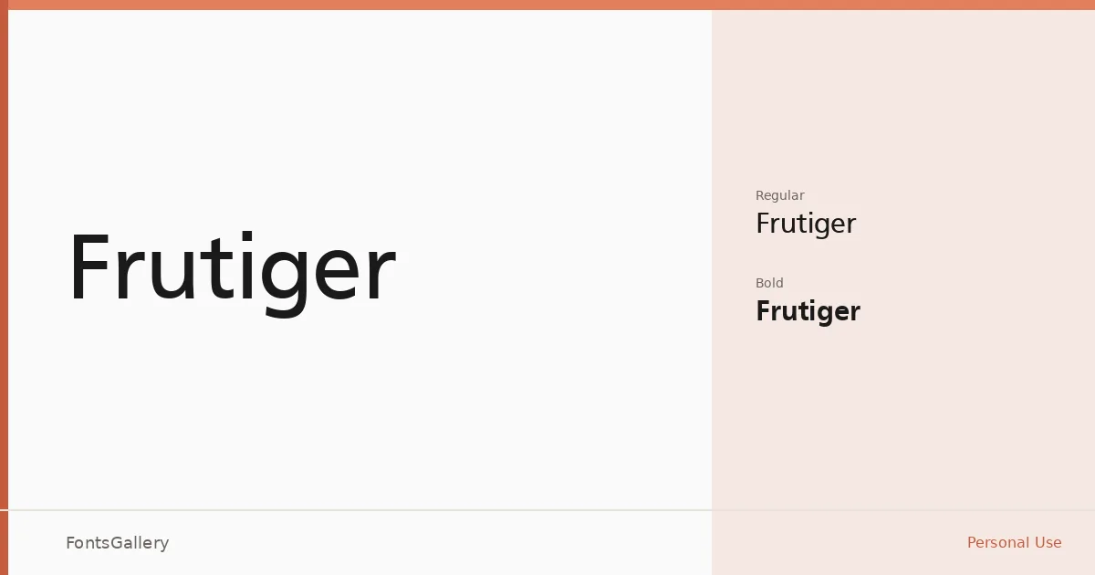
About Frutiger Font
There is a particular clarity to these letterforms — open apertures, even stroke weights, and terminals that feel resolved rather than merely truncated. The family arrives here in two cuts, Regular and Bold, distributed as TTF files, with a copyright notice tracing back to URW Unternehmensberatung.
Design Aesthetics & Character Characteristics
This is a sans serif built around legibility rather than personality, which is precisely what makes it so recognizable. The mood lands somewhere between minimal and classic — modern in its geometry but never cold, professional without feeling corporate. Regular carries the text comfortably at smaller sizes, while Bold supplies the contrast needed for headlines and emphasis. Both weights share the same humanist rationality that has made this design a reference point in the category.
Recommended Usage & Font Pairing
Its Latin character set and clean construction make it a natural fit for signage, branding systems, magazine layouts, website headers, and presentation decks — anywhere that demands immediate readability at a range of sizes. For pairing, it holds its ground beside the editorial softness of Canela or ABC Arizona, sits comfortably against the script warmth of Armelie, and creates deliberate contrast when set alongside Kactigona or Minecraft.
License & Usage Terms
This family is released under a Personal Use license, which does not allow commercial use — confirm licensing terms before deploying it in client or commercial work. Embedding is set to installable.