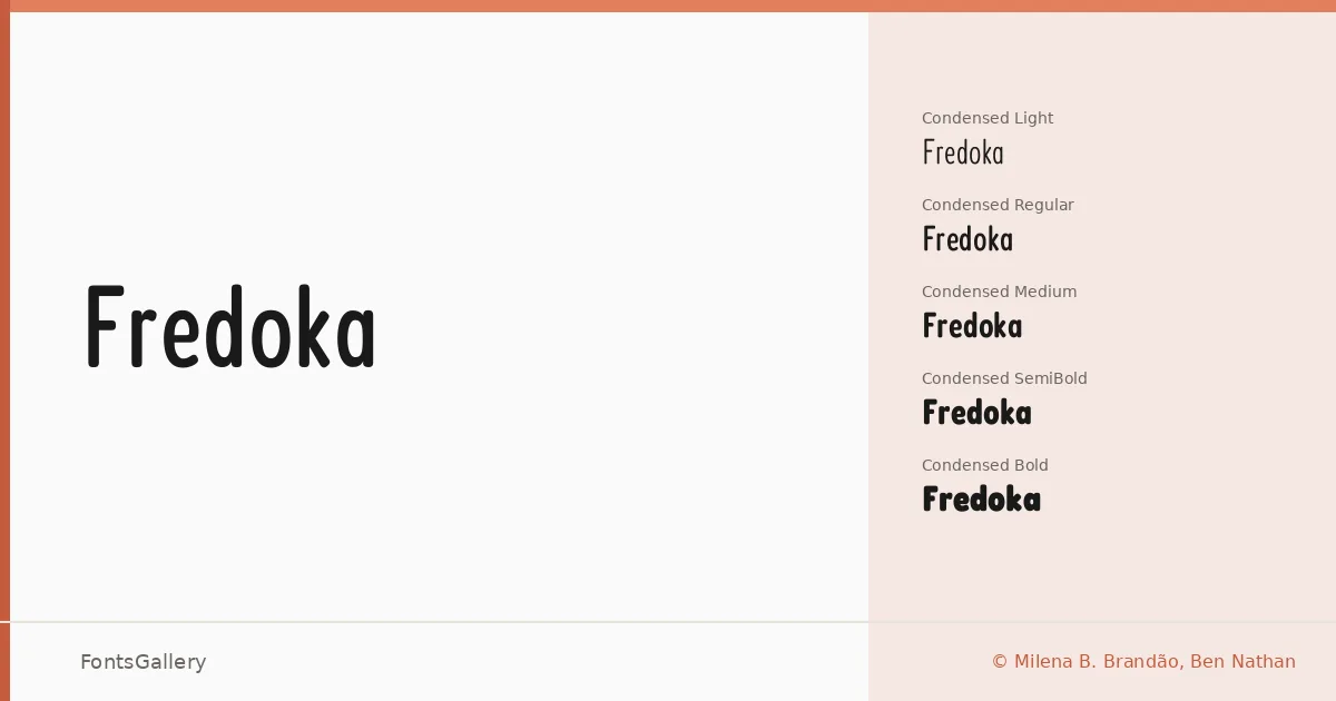
About Fredoka Font
There is something immediately warm about these letterforms — rounded terminals, generous curves, and a friendliness that never tips into clumsiness. Designed by Ben Nathan, with production from Milena B. Brandão, the family covers both Latin and Hebrew scripts, which is a meaningful extension that shapes how the design holds together across character sets. The underlying geometry is disciplined enough to read as modern, yet the softness in every stroke keeps it from feeling cold.
Design Aesthetics & Character Characteristics
This is a rounded sans serif that moves across a wide range of widths and weights — from Condensed Light through Expanded Bold, with a Variable file that lets you slide between them in a single TTF. The full set spans Light, Regular, Medium, SemiBold, and Bold, each available in Condensed, SemiCondensed, Regular, SemiExpanded, and Expanded widths. The overall mood is playful and minimal at once: headlines feel bold and legible without aggression, and the lighter cuts carry a quietness that works well when you need something modern but not severe.
Recommended Usage & Font Pairing
The family earns its place in branding, logo work, poster headlines, and social media graphics — anywhere the text needs to pull attention without shouting. Hebrew support makes it genuinely useful for bilingual publishing and Israeli brand work that needs a consistent visual register across both scripts. It pairs naturally with Canela for editorial contrast, sits well alongside Armelie for softer, more illustrative contexts, and can hold its own next to the heavier display energy of Urban Thunder Demo, AQUA, or Kactigona when a project calls for layered typographic voices.
License & Usage Terms
Released under the SIL Open Font License (OFL), Version 1.1, which permits commercial use — full terms and FAQ are available at http://scripts.sil.org/OFL. Embedding is set to installable, so you can bundle the font in documents and applications without restriction beyond the OFL conditions.