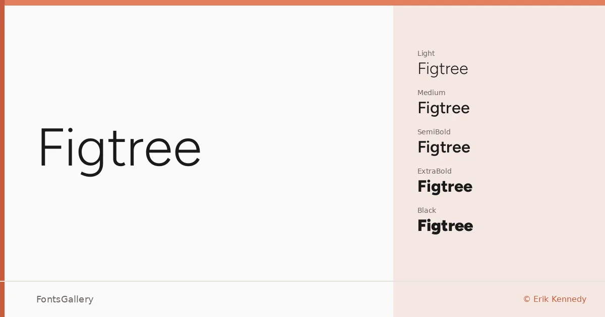
About Figtree Font
There is a quiet confidence to this geometric sans — clean terminals, near-perfect circles in the rounds, and a consistency across weights that feels deliberate rather than mechanical. It comes from designer Erik Kennedy, and the family spans Light through Black, each weight paired with a true italic, plus variable font files that give you the full range in a single TTF.
Design Aesthetics & Character Characteristics
Figtree sits in that productive middle ground between minimal and modern — not so stripped that it loses warmth, not so expressive that it competes with content. The sixteen styles — Light through Black in both upright and italic, alongside variable and variable italic cuts — give you real flexibility in hierarchy without switching families. The italics are genuine companion cuts rather than slanted afterthoughts, which matters especially in editorial and interface work where emphasis needs to hold its own.
Recommended Usage & Font Pairing
The professional, minimal character makes it a natural fit for branding systems, business cards, presentation decks, and website headers — anywhere Latin-script copy needs to read crisply at a range of sizes. It pairs well with the editorial weight of Canela, the calligraphic warmth of Armelie, the high-impact personality of 321 Impact, the refined detail of ABC Arizona, and the display energy of Kactigona, giving you pairing options across a wide tonal range depending on the job.
License & Usage Terms
Released under the SIL Open Font License, Version 1.1, commercial use is permitted and embedding is installable — full license details and FAQ are available at openfontlicense.org.