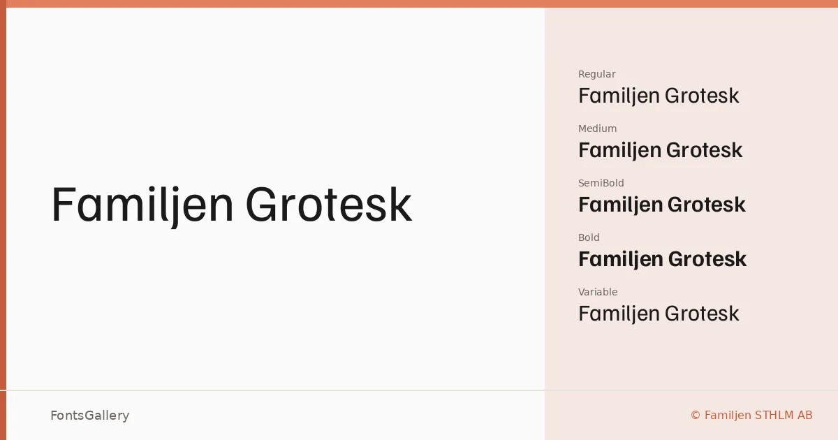
About Familjen Grotesk Font
There is a quiet confidence to this sans serif — the kind that comes from letterforms drawn with genuine restraint rather than forced simplicity. Created by Anders Wikstroem, Jonas Baeckman, Matilda Gysing, and Kristian Moeller at Familjen STHLM AB, it carries a Nordic economy of detail: strokes that taper exactly as much as they need to, terminals that don't linger, and spacing that breathes without going slack.
Design Aesthetics & Character Characteristics
The family sits in classic-to-modern grotesque territory — minimal, professional, and free of the affectations that date a face quickly. Weights run from Regular through Medium, SemiBold, and Bold, each with a companion italic, and the set includes both variable and variable italic files in TTF format for environments where a continuous weight axis is useful. The italics are properly sloped rather than simply obliqued, which gives them enough personality to carry emphasis without interrupting the overall tone.
Recommended Usage & Font Pairing
Its clean structure makes it particularly well suited to branding systems, presentation decks, business cards, magazine layouts, and website headers — anywhere consistency across weights matters more than decorative flair. Latin and partial Latin Extended coverage extends to Vietnamese, which broadens its reach for multilingual work. It pairs with intention alongside contrasting faces like Canela or ABC Arizona for editorial contexts, Armelie for a softer touch, Kactigona when something geometric is needed nearby, or even Minecraft when a project calls for tonal distance between text roles.
License & Usage Terms
Released under the SIL Open Font License (OFL), Version 1.1, commercial use is fully permitted; embedding is set to installable, so you can embed it freely in documents and applications — full terms are at https://scripts.sil.org/OFL.