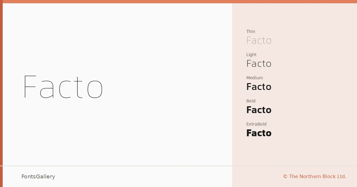
About Facto Font
There is a quiet precision to these letterforms — slightly condensed curves built from a compact geometric grid that keeps everything crisp without ever feeling mechanical. Jonathan Hill designed this geometric sans serif for The Northern Block Ltd., and the family spans twelve cuts: Thin through ExtraBold, each with a matching Oblique, delivered as OTF files.
Design Aesthetics & Character Characteristics
The mood is minimal and professional, leaning modern without chasing trends. Unadorned construction and restrained proportions give the full weight range — Thin Oblique at one end, ExtraBold Oblique at the other — a coherent, measured presence across every size. That geometric clarity reads efficiently in information-dense contexts: user interfaces, mobile layouts, and screen-facing editorial work all absorb it naturally.
Recommended Usage & Font Pairing
The condensed geometry makes it a strong candidate for branding, logo work, magazine layouts, website headers, and presentation decks where legibility needs to hold at both large and small scales. When pairing, the family sits well alongside the editorial softness of Canela, the script warmth of Angeletta or Magnolia Script, the sturdy familiarity of Times New Roman, and even the blocky character of Minecraft for more playful contrasts.
License & Usage Terms
This family is available under a Demo license, which covers personal use only — confirm clearance at the license URL before applying it to any commercial job. Embedding is permitted for preview and print only.