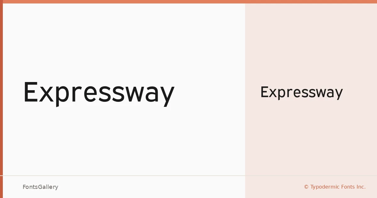
About Expressway Font
There is something immediately decisive about this typeface — the strokes are clean, the spacing measured, and the overall impression is one of a sans serif that knows exactly what it is. It comes from Raymond Larabie at Typodermic Fonts Inc., a designer whose output consistently favors clarity over ornament. Available as a single Regular weight in OTF format, it carries that confidence without leaning on variety.
Design Aesthetics & Character Characteristics
The design sits squarely in modern, minimal sans-serif territory — the kind of letterforms that read as professional without feeling corporate or cold. There is a boldness to the proportions even in the Regular cut, which gives it an authoritative presence at display sizes. The geometry is restrained rather than rigid, so it holds together whether it is set large or used for a tighter headline block. Language coverage extends across Latin, Vietnamese, Cyrillic, and Greek, making it genuinely useful across a range of international projects.
Recommended Usage & Font Pairing
It earns its keep in headline, poster, signage, and branding contexts — anywhere the type needs to land with immediate clarity rather than invite close reading. Advertisement work is a natural fit as well, given how well the forms hold at scale. For pairing, the editorial softness of Canela makes a strong contrast, while the script personality of Armelie or the energy of Urban Thunder Demo can introduce warmth or attitude alongside it; AQUA and Kactigona round out the options for projects needing something more decorative in the secondary role.
License & Usage Terms
Expressway is offered under Personal Use terms, which means commercial use is not permitted — confirm licensing with Typodermic Fonts Inc. before committing it to any client or commercial job. Embedding is restricted to preview and print only.