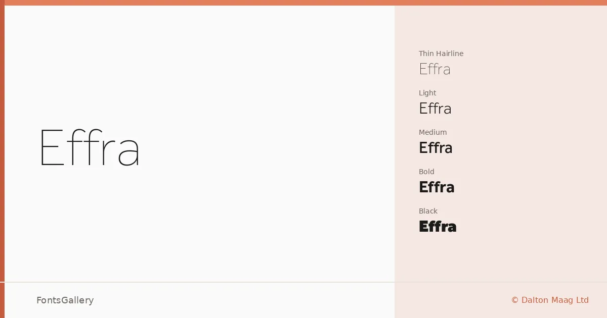
About Effra Font
There is a particular kind of geometric sans that manages to feel both considered and unobtrusive — Effra sits squarely in that territory. Drawn by Jonas Schudel and developed at Dalton Maag Ltd, the family carries the foundry's characteristic attention to technical rigour alongside a warmth that keeps it from feeling cold. The letterforms have an open, even texture, with just enough humanist inflection in the construction to stop them reading as purely mechanical.
Design Aesthetics & Character Characteristics
The family spans an unusually wide tonal range: from Hairline and Thin at the finest end, through Light, Regular, Medium, and SemiBold, up to Bold, XBold, and Black — each weight accompanied by a true italic. That full ladder of eighteen styles means you can maintain a consistent voice across a hierarchy without reaching for a second family. The overall mood is minimal and professional, with the kind of quiet elegance that reads as modern without chasing trends. Files are delivered in TTF format.
Recommended Usage & Font Pairing
The neutrality and range of the family make it a natural fit for branding systems, business card design, magazine layouts, presentation decks, and website headers — contexts where consistency across weights matters as much as the individual cut. It carries Latin, Cyrillic, Greek, and Arabic script support, which opens it up for multilingual editorial and corporate work. For contrast, it pairs well with the editorial serif Canela, the expressive Angeletta, the broad-stroke Dharma Gothic E, the reliable workhorse Times New Roman, or the display character of Rasley Heights.
License & Usage Terms
This family is available under a Demo license, which does not permit commercial use — confirm your intended use directly with Dalton Maag Ltd at their EULA page before committing it to any client project. The embedding permission is set to editable.