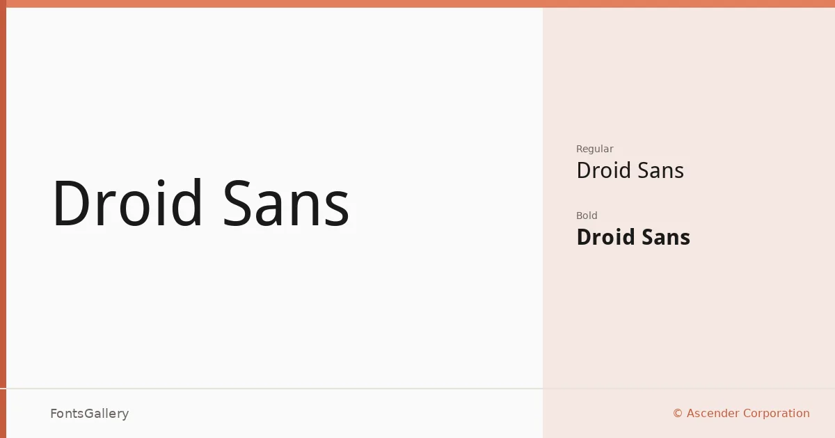
About Droid Sans Font
There is a quiet confidence to this face — the kind that comes from being designed with a clear purpose rather than a stylistic agenda. Built by Ascender Corporation for user interfaces and electronic communication, it belongs to the humanist sans serif tradition, where letterforms carry just enough warmth from calligraphic heritage to keep text readable at small sizes without sacrificing the clean, open counters that screens demand. Copyright is held by Google Corporation.
Design Aesthetics & Character Characteristics
The family comes in two cuts — Regular and Bold — delivered as TTF files, which keeps things uncomplicated and deployment-ready. The mood lands somewhere between classic and minimal: professional enough for business contexts, modern enough not to feel dated, and restrained enough that the content always leads. Nothing in the letterforms calls attention to itself, which is exactly the point. The spacing is generous, the terminals are clean, and the Bold provides genuine contrast without tipping into heaviness.
Recommended Usage & Font Pairing
The Latin coverage makes it well suited to branding work, business cards, presentations, signage, and website headers — anywhere legibility under pressure matters more than personality. When you need contrast at the pairing stage, the rational structure here plays well against something with more character: the editorial softness of Canela, the script energy of Armelie, the display weight of ABC Arizona, the geometric irregularity of Kactigona, or the pixelated nostalgia of Minecraft each create a different kind of tension against its neutrality.
License & Usage Terms
Droid Sans is available for commercial use, licensed under the Apache License, Version 2.0, which also permits editable embedding — full terms are at http://www.apache.org/licenses/LICENSE-2.0.