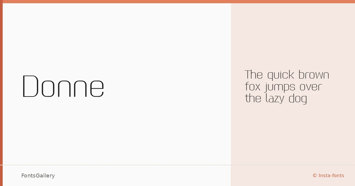
About Donne Font
There is a particular kind of restraint in a hairline sans — every curve and terminal has to earn its place. This single-weight family, drawn by Insta-fonts and copyrighted to Md Shohail Bhuian, arrives in a Thin 100 cut that commits fully to that restraint. The strokes are spare and open, carrying just enough structure to feel considered rather than fragile.
Design Aesthetics & Character Characteristics
The family is a sans serif built around an elegant, minimal sensibility with a distinctly modern edge. With only the Thin 100 weight available in OTF format, the design is focused rather than expansive — what you get is a single, deliberate register pitched at the quieter end of the typographic spectrum. The thin stroke contrast reads beautifully at large sizes, where the geometry of each letterform has room to breathe.
Recommended Usage & Font Pairing
The weight and mood suit headline-scale work — think poster type, magazine covers, website headers, and branding or logo lockups where understatement carries more authority than density. Among the named pairings, the warmth of Canela or the calligraphic flow of Armelie would contrast productively against these geometric strokes, while something as blunt as Minecraft or as decorative as Kactigona would push the combination into more expressive territory.
License & Usage Terms
Donne is available under Personal Use terms, which means commercial use is not permitted — confirm licensing with the copyright holder before committing it to a client job. Embedding is set to editable.