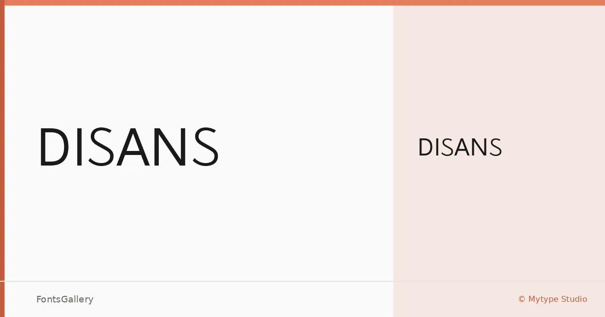
About Disans Font
There is a deliberate quietness to this sans serif — the kind that comes from restraint rather than absence of thought. Designed by Mhd Husaini of Mytype Studio and built in FontLab 7, Disans arrives as a single Regular weight in OTF format, its letterforms drawn with the clean geometry that suits minimal, modern, and professional work.
Design Aesthetics & Character Characteristics
The family sits firmly in the sans serif tradition, stripped of decoration and tuned for clarity. One weight means every decision about spacing and proportion carries full responsibility, and the forms hold up: this is a face shaped for headlines and identity work where a composed, contemporary tone matters more than stylistic flourish. Its minimal character makes it feel controlled in use rather than cold.
Recommended Usage & Font Pairing
The design is well suited to branding systems, logo lockups, business cards, and presentation decks where a clean typographic voice needs to read with authority at larger sizes. For body text or secondary hierarchy, the listed pairing families — Canela, Angeletta, Times New Roman, Armelie, and Minecraft — each offer a distinct contrast: the warm editorial serif of Canela, the script energy of Armelie and Angeletta, the familiarity of Times New Roman, or the blocky texture of Minecraft.
License & Usage Terms
This family is offered under Personal Use terms with embedding limited to preview and print only — confirm licensing directly with Mytype Studio before committing it to any commercial job, as commercial use is not covered by the standard download.