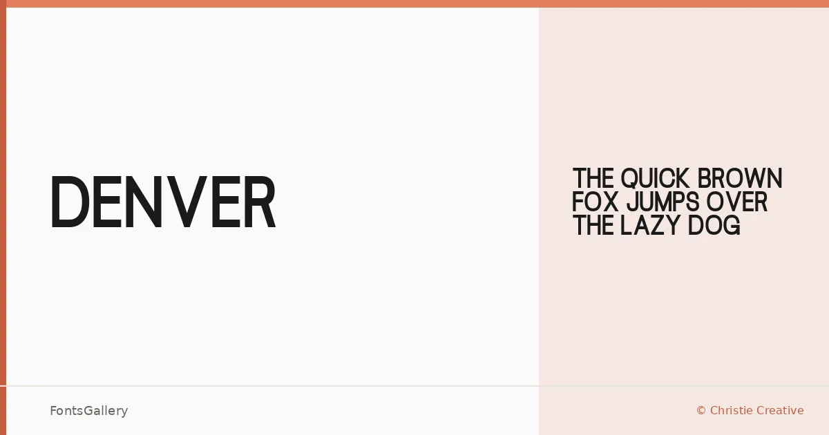
About Denver Font
There is a deliberate restraint to this face — clean strokes, minimal fuss, and a confidence that reads immediately at display sizes. Alexa Christie, working under Christie Creative, drew it as a single Regular weight, and that focused scope gives it a clarity that sprawling families sometimes lose.
Design Aesthetics & Character Characteristics
It sits in the sans serif category but leans toward the bold and modern end of that spectrum — the kind of letterforms that feel at home on a large headline rather than a column of body copy. With one weight available in both TTF and OTF formats, the family is a tight, purposeful tool rather than a flexible system. The minimal construction keeps things professional without feeling cold.
Recommended Usage & Font Pairing
Branding, logo lockups, posters, and advertisement headlines are where this face earns its keep — anywhere the type needs to project authority at a glance. Paired with the editorial softness of Canela, the script warmth of Angeletta or Armelie, the neutral familiarity of Times New Roman, or the playful geometry of Minecraft, it anchors a layout while leaving room for contrast in supporting roles.
License & Usage Terms
Denver is released under Personal Use terms, which means it is not cleared for commercial work — confirm licensing with Christie Creative before deploying it in any paid or commercial context.