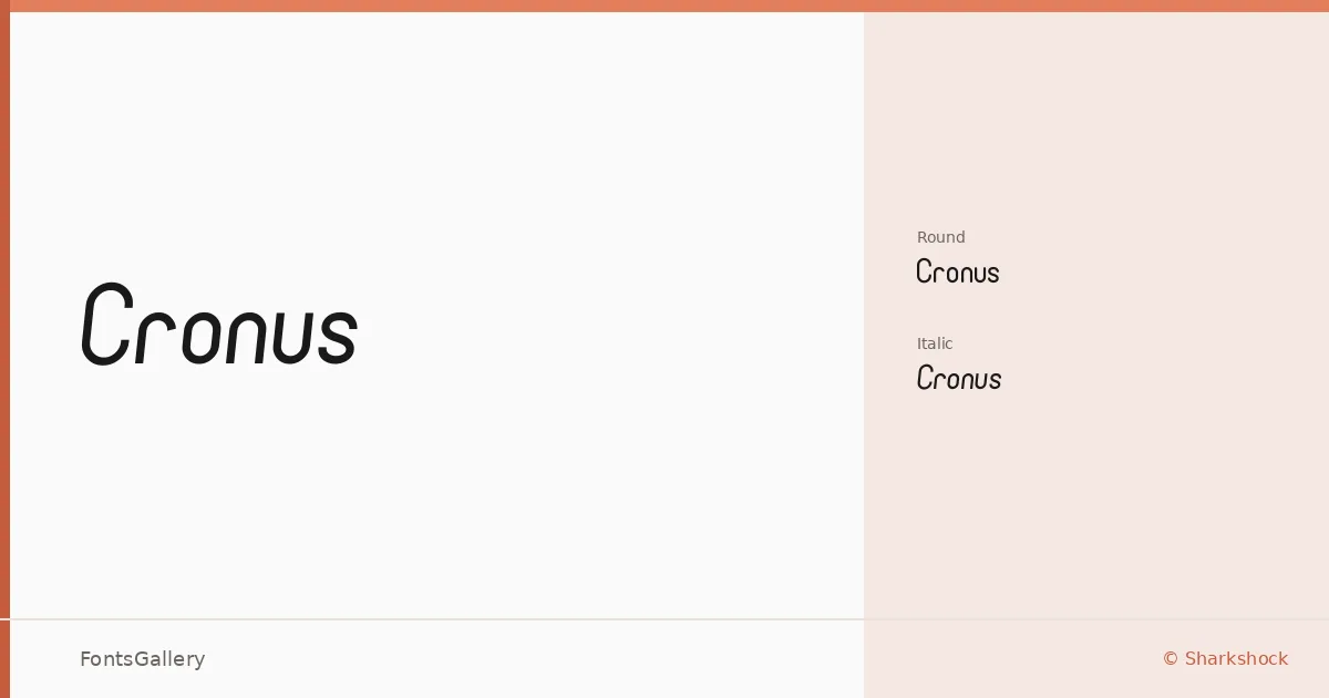
About Cronus Font
There is a clean confidence to these letterforms — the kind that comes from restraint rather than reduction. Sharkshock built the family as two complementary cuts: a standard italic and a rounded variant, both delivered as OTF files. The rounded treatment in particular softens the geometry just enough to keep things approachable without losing the modern composure underneath.
Design Aesthetics & Character Characteristics
This is a sans serif that sits comfortably between minimal and playful — structured enough to read as professional, but with enough personality to hold its own in branding and poster work. The two styles, Regular Italic and Regular Round, give you a choice between a sharper, more dynamic slant and a friendlier, softer alternative. Neither style overstays its welcome at large display sizes, which is exactly where the forms are built to perform.
Recommended Usage & Font Pairing
The family earns its place in logo work, website headers, and social media graphics where legibility at a glance matters. Latin-script projects are the natural fit. For pairing, the clean lines here sit well alongside the editorial warmth of Canela or ABC Arizona, and contrast interestingly against the expressive personalities of Armelie and Kactigona — with 321 Impact available when you need a harder edge in the same layout.
License & Usage Terms
Cronus is released under Personal Use terms, so confirm licensing with Sharkshock before committing it to a commercial job. Embedding is permitted as editable.