About Creo Font
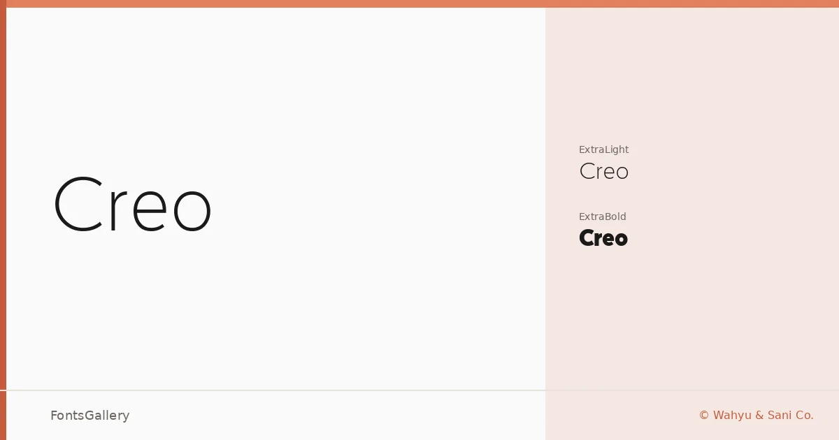
There is a studied restraint to this sans serif — the kind that comes from decisions about what to leave out rather than what to put in. Designed by Wahyu & Sani Co., it carries a minimal, modern character that reads as deliberate without feeling cold. The letterforms are clean and geometry-leaning, with enough refinement to sit comfortably in professional contexts.
Design Aesthetics & Character Characteristics
The family ships in two TTF cuts — ExtraLight and ExtraBold — which is a purposeful, high-contrast pairing rather than a conventional weight ladder. That spread gives you a delicate, almost editorial lightness at one end and a strong, commanding presence at the other. The overall mood lands in elegant and professional territory, with the minimal construction keeping things from tipping into decorative.
Recommended Usage & Font Pairing
The ExtraLight suits magazine layouts and website headers where atmosphere matters as much as legibility, while the ExtraBold carries enough weight for logos and branding marks that need to hold at small sizes on a business card. For pairing, the family works well alongside serif voices like Canela and Times New Roman, and softer script companions such as Angeletta and Armelie add contrast without competing; Minecraft offers a more unexpected, stylistic counterpoint for editorial or digital work that wants character. Latin script is supported throughout.
License & Usage Terms
This family is offered under Personal Use terms — commercial use is not permitted, so confirm licensing with Wahyu & Sani Co. before deploying it in any paid or commercial project. Embedding is permitted at the editable level.