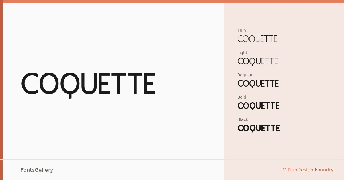
About Coquette Font
There is a composed restraint to this sans serif that makes it feel deliberately considered rather than casually drawn. Released in 2023 under NanDesign Foundry, it was designed by Frada Nanda with a clear eye for clean geometry and refined proportion. The letterforms stay minimal without feeling cold — there is just enough character in the curves to keep things from going sterile.
Design Aesthetics & Character Characteristics
The family spans five weights — Thin through Black — giving it a genuine range from whisper-light editorial text to assertive display work, all delivered in TTF and OTF formats. The overall mood sits at the intersection of classic elegance and modern minimalism: strokes are even, spacing is measured, and nothing crowds the eye. Moving from the Thin to the Black, the personality stays consistent; only the weight changes, not the underlying discipline.
Recommended Usage & Font Pairing
The lighter cuts are well suited to magazine layouts and website headers where air and clarity matter, while the Bold and Black earn their place in logo work and branding systems that need presence without noise. Business cards set in the Light or Regular carry a quiet confidence that feels current. For pairing, the family works naturally alongside Canela, Angeletta, ABC Arizona, and Armelie for contrast-driven editorial combinations, or with Minecraft when a project calls for a harder tonal shift.
License & Usage Terms
Coquette is released under a Personal Use license — free for personal projects, but commercial use is not permitted under these terms, so confirm licensing with NanDesign Foundry before taking it into paid client work.