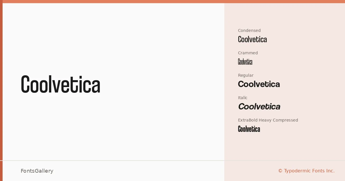
About Coolvetica Font
There is something immediately recognizable in the geometry here — the tight spacing, the clipped terminals, the way the letterforms carry that particular confidence of late-twentieth-century grotesque revival without simply repeating it. Raymond Larabie of Typodermic Fonts Inc. built this family across a span reaching from 1999 through 2024, and the result is a sans serif that wears its modernist references openly while still feeling like its own thing.
Design Aesthetics & Character Characteristics
The family ships in five OTF cuts: a Regular, a Regular Italic, a Condensed, a Crammed, and the ExtraBold Heavy Compressed — a range that moves from workhorse neutral to densely packed headline muscle. The mood runs bold and minimal at once, keeping things professional without going corporate-cold. The compressed and crammed styles are where the design really shows its character, stacking weight and width in ways that demand attention at large sizes. Coverage extends across Latin, Vietnamese, Cyrillic, and Greek, which opens the family up well beyond purely Western typesetting.
Recommended Usage & Font Pairing
This is a family built for scale — headlines, posters, logos, and branding work where you need a sans that reads from a distance and holds its shape under pressure. Advertisement layouts that need impact without decorative noise are a natural fit. For contrast pairings, the listed companions include Canela, Armelie, 321 Impact, AQUA, and Kactigona, each offering a different kind of counterweight to the grotesque structure here.
License & Usage Terms
Coolvetica is available under Personal Use terms — commercial use is not permitted under this license, so confirm your rights before taking it into any paid or client-facing work. Embedding is limited to preview and print only.