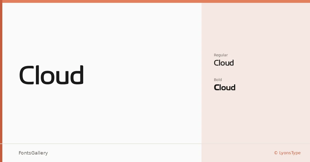
About Cloud Font
There is a clean restraint to these letterforms — smooth, open, and uncluttered in a way that reads as deliberate rather than sparse. Daniel Lyons of LyonsType drew this Latin-coverage sans serif in two weights: Regular and Bold. The contrast between the two cuts is controlled and useful, giving the family just enough range for hierarchical work without overcomplicating the palette.
Design Aesthetics & Character Characteristics
The overall mood sits squarely in minimal, modern, professional territory — the kind of sans that steps back and lets content lead. Both the Regular and Bold are delivered as TTF files, making them straightforward to install and test across environments. The forms carry an even stroke weight and generous spacing that keeps headlines airy and logotypes from feeling crowded.
Recommended Usage & Font Pairing
The family earns its keep in branding systems, logo lockups, business cards, and website headers — anywhere a clean Latin-character headline needs to hold attention without fuss. For pairing, the family has been matched with Aresink, Ballmain, 321 Impact, Bizantheum, and Batoshi, each offering a distinct contrast in texture or weight that can anchor body copy or decorative elements beneath Cloud's composed headline presence.
License & Usage Terms
This family is released under the Creative Commons Attribution-NonCommercial-ShareAlike 4.0 International Public License — commercial use is not permitted under these terms, so confirm an appropriate license with LyonsType before deploying it in any paid or revenue-generating work. The font is installable for embedding purposes.