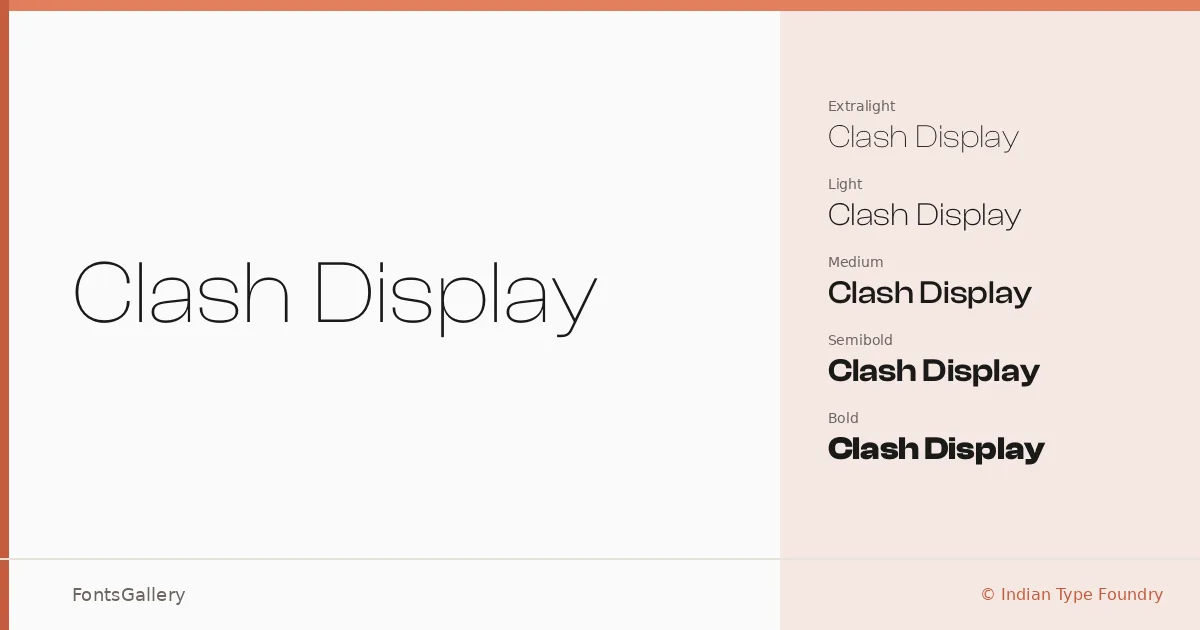
About Clash Display Font
There is a particular tension in the letterforms here — geometric rigidity pushed just far enough toward editorial warmth that headlines feel considered rather than mechanical. This is a Latin sans serif released by Indian Type Foundry, a foundry with a strong track record of typefaces built for demanding display work. The terminals and proportions are calibrated for large sizes, where every curve decision becomes visible.
Design Aesthetics & Character Characteristics
The family runs from ExtraLight through Bold — six weights: ExtraLight, Light, Regular, Medium, SemiBold, and Bold — all delivered as OTF files. The lighter cuts carry a minimal, airy quality that suits fashion and editorial contexts, while the heavier weights land with the kind of professional authority that branding and poster work demands. Across the range, the modern proportions hold their consistency well, so moving between weights within a layout feels deliberate rather than disjointed.
Recommended Usage & Font Pairing
This family earns its keep in headline-driven work: magazine covers, brand identity systems, logotype exploration, and large-format poster design where the weight range lets you build visual hierarchy within a single family. For text companions or contrasting display pairings, it has been matched with Aresink, Ballmain, 321 Impact, Bizantheum, and Batoshi. Language coverage is Latin.
License & Usage Terms
Clash Display is available for commercial use under the terms at fontshare.com/terms, with installable embedding permitted — though the license requires that you identify the fonts by name and credit Indian Type Foundry's ownership of the trademarks and copyrights in any design or production credits.