About Chill Font
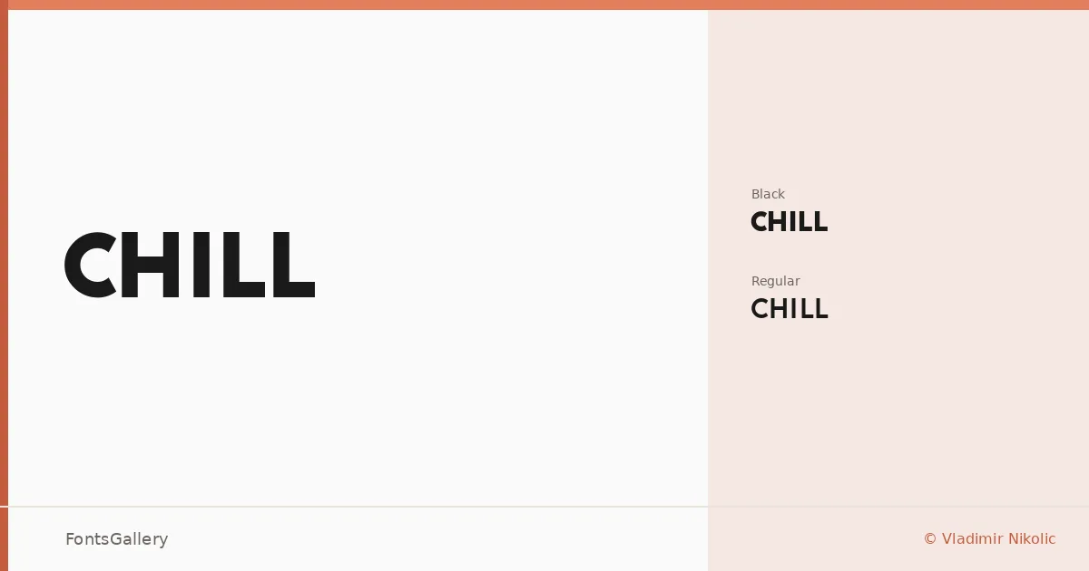
There is a quiet confidence in how these letterforms hold their ground — clean geometry, no decoration, nothing wasted. Chill is a sans serif family designed by Vladimir Nikolic, arriving in two cuts: a regular weight and a Black that carries real mass without losing the minimal spirit underneath.
Design Aesthetics & Character Characteristics
The family sits in modern, professional territory — bold in intention even at the lighter weight, and genuinely commanding at Black. Both styles are delivered as TTF files, keeping the setup straightforward. The forms are stripped down and geometric, the kind of shapes that read as deliberate rather than spare, giving headlines and logotypes the breathing room they need without relying on ornamentation.
Recommended Usage & Font Pairing
This is a family built for high-visibility work: brand identities, poster headlines, logo lockups, and social media graphics where the type needs to land quickly and hold attention. For contrast-driven pairings, the listed companions span a wide range of character — the editorial warmth of Canela or ABC Arizona, the script softness of Angeletta and Armelie, and the hard pixelated grid of Minecraft all offer interesting tension against its clean strokes.
License & Usage Terms
This family is released under Personal Use terms, which means commercial use is not permitted — confirm licensing with Vladimir Nikolic before committing it to a paid project. Embedding is limited to preview and print only.