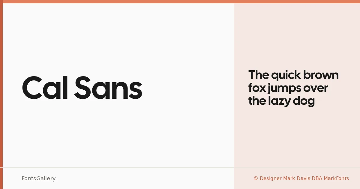
About Cal Sans Font
There is a cleanness to this typeface that announces itself immediately — no ornament, no apology, just precise geometric construction with enough warmth to keep it from feeling cold. It comes from Designer Mark Davis DBA MarkFonts, and the single Regular weight is built as a TTF with installable embedding permissions. The letterforms sit in that confident middle ground between strict modernism and approachable clarity.
Design Aesthetics & Character Characteristics
Cal Sans is a sans serif drawn with a minimal, professional sensibility — the kind of face that reads as modern without chasing trends. The single Regular style means you are working with one carefully considered cut rather than a sprawling system, which focuses its character considerably. In use, the forms feel open and even-tempered: wide enough to anchor a headline, controlled enough to hold a logotype together. Latin and Vietnamese are both supported, giving it real utility across multilingual work.
Recommended Usage & Font Pairing
This is a face built for display work — branding systems, poster headlines, website headers, and logo lockups are where it earns its keep. The clean geometry makes it a natural anchor in a typographic hierarchy. For pairing, the contrast-rich serif Canela makes an elegant companion, while 321 Impact brings raw weight against its restraint; Armelie, AQUA, and Kactigona each offer different textural counterpoints depending on the tone of the project.
License & Usage Terms
Released under the SIL Open Font License, Version 1.1, commercial use is permitted. Full terms and FAQ are available at https://openfontlicense.org.