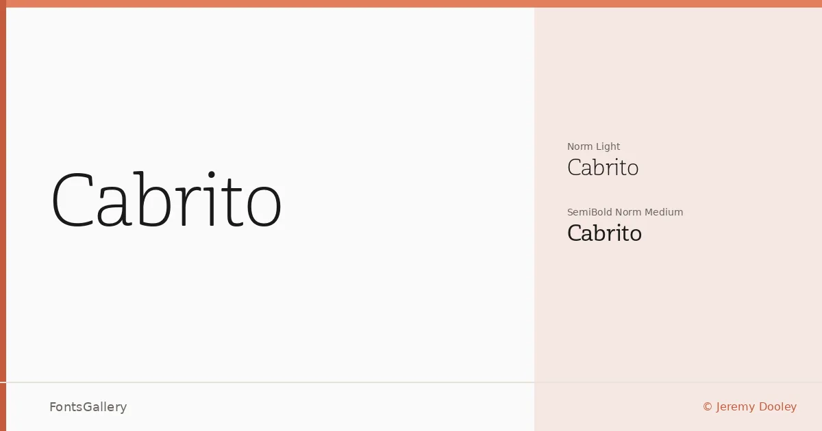
About Cabrito Font
There is a quiet confidence in these letterforms — a geometric clarity that holds its shape without becoming cold. Jeremy Dooley drew this sans serif family, and the two cuts available reflect a deliberate editorial restraint: a Light Norm Light and a SemiBold Norm Medium, offered in OTF format. The spacing feels considered, the strokes even, with just enough optical warmth to keep text approachable at display sizes.
Design Aesthetics & Character Characteristics
The family sits firmly in elegant, minimal, modern territory — the kind of sans that reads as professional without announcing itself. With just the Light and SemiBold weights, the range is intentionally narrow, which means the contrast between the two cuts does real work: the lighter cut breathes, and the SemiBold anchors. Latin character coverage supports the clean typographic needs of Western European contexts. Both cuts are clean enough to hold up in tight settings like business cards or slide headers.
Recommended Usage & Font Pairing
Branding projects, magazine layouts, presentation decks, and website headers are where these weights earn their keep — anywhere a composed, unhurried sans is needed to lead the eye. The family pairs well with contrasting voices: the editorial serif warmth of Canela, the handwritten flourish of Armelie, the display energy of Urban Thunder Demo, the structured geometry of AQUA, or the informal rhythm of Kactigona. Each of those pairings plays on the neutrality of this family to create tension or softness depending on the job.
License & Usage Terms
Cabrito is available under Personal Use terms, which means commercial use is not permitted — confirm licensing directly with Jeremy Dooley at insignedesign.com before taking it into a client or commercial project. Embedding is restricted to preview and print only, per the EULA at http://www.insignedesign.com/EULA.